Hawthorn Park Signage & Wayfinding
Signage & Wayfinding
2021, Brand expression - physical signage & wayfinding
Having created the name, visual identity and marketing campaign for the Hawthorn Park property development, Self-titled were tasked with extending the brand into the built form in order to create a comprehensive signage and wayfinding scheme covering 4 low rise buildings, linked by walkways, gardens and Melbourne’s first suspended skypool.

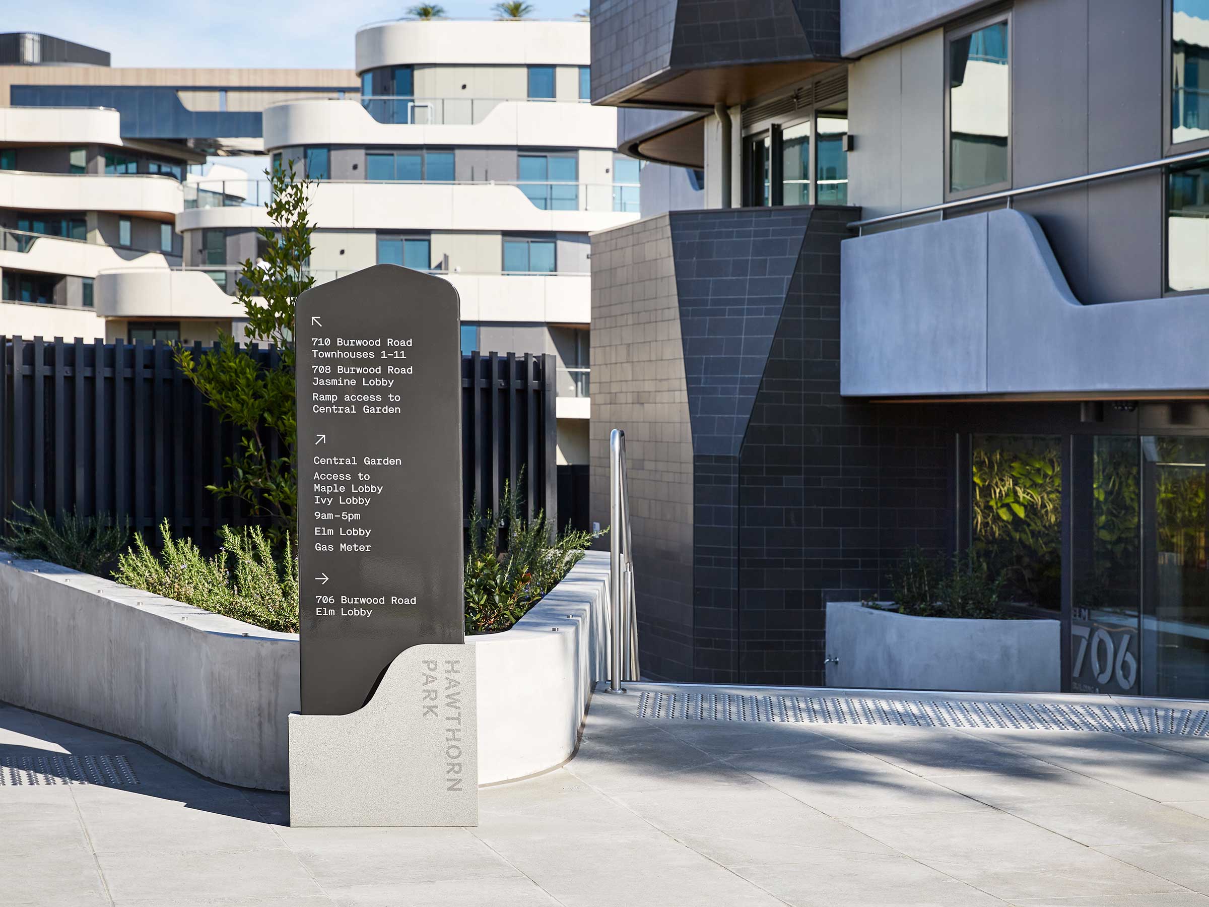
We partnered with Studio Unfold on a wayfinding strategy which took into account site identification, access, circulation and key decision points.
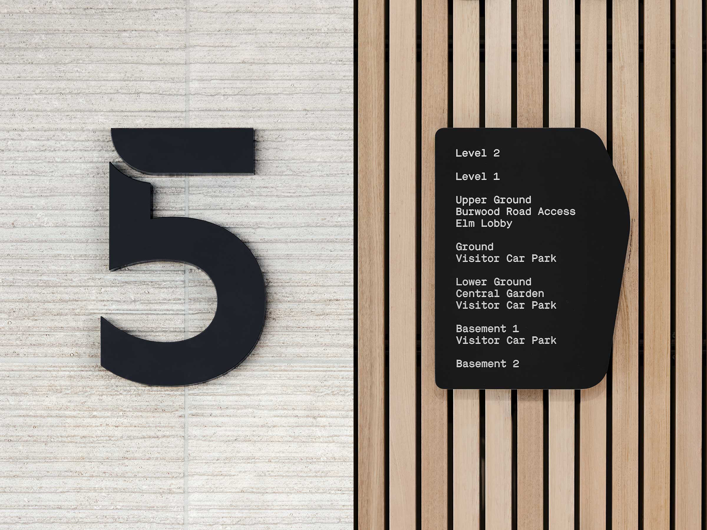
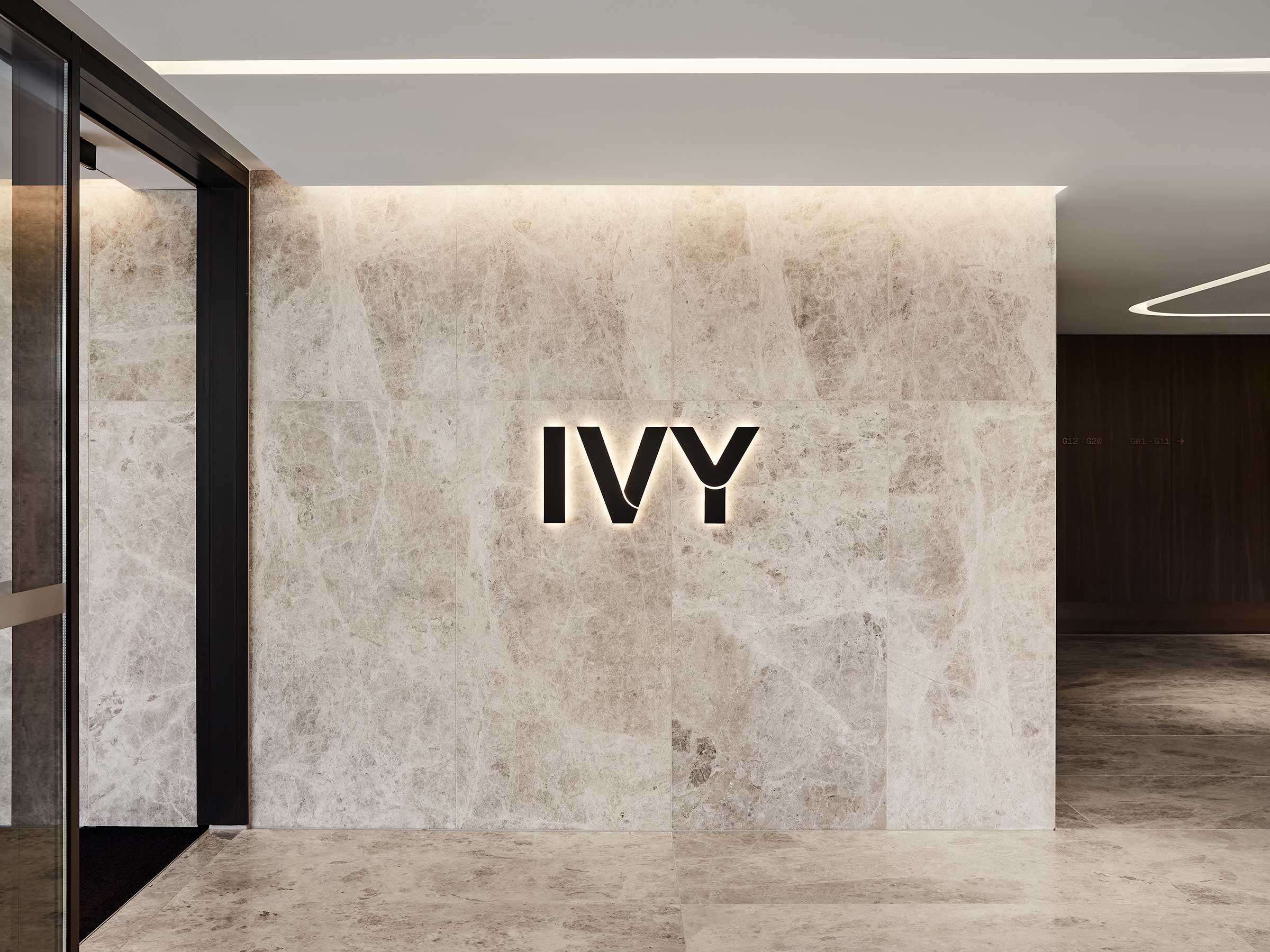
Key site and level identification signs utilise both the three dimensional and two dimensional versions of the bespoke Hawthorn Park typeface.
The physical shape of the signs are inspired by the stepped organic architectural forms.


The hero site identification signage perfectly reflects the importance of this iconic project for developer Dahua, while the wayfinding complements the architectural form and material palette creating a considered and harmonious relationship.
The hero site identification signage perfectly reflects the importance of this iconic project for developer Dahua.
Credits
Jake Smallman
Ryan Winter
Oliver Kowald
Collaborators
Studio Unfold, Wayfinding strategy
Tess Kelly, Photography
Typefaces
Hawthorn Park Semibold, designed in-house
Related Projects
View case studies by sector or service