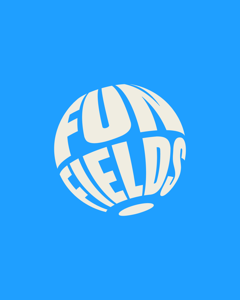
Hoopla
Entertainment Unlimited
in the first 10 weekends post launch
more locations opening
Your toddler loves a playcentre, your older kids – bowling and rock-climbing. You’d probably rather be with friends at a cafe or restaurant. So where can you take the whole family, that everyone will like?
With decades of experience operating some of Australia’s best-loved indoor play centres, Playfection set out to answer this most difficult of questions.
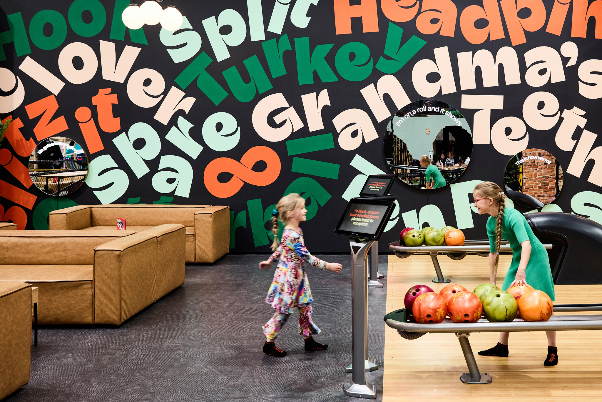
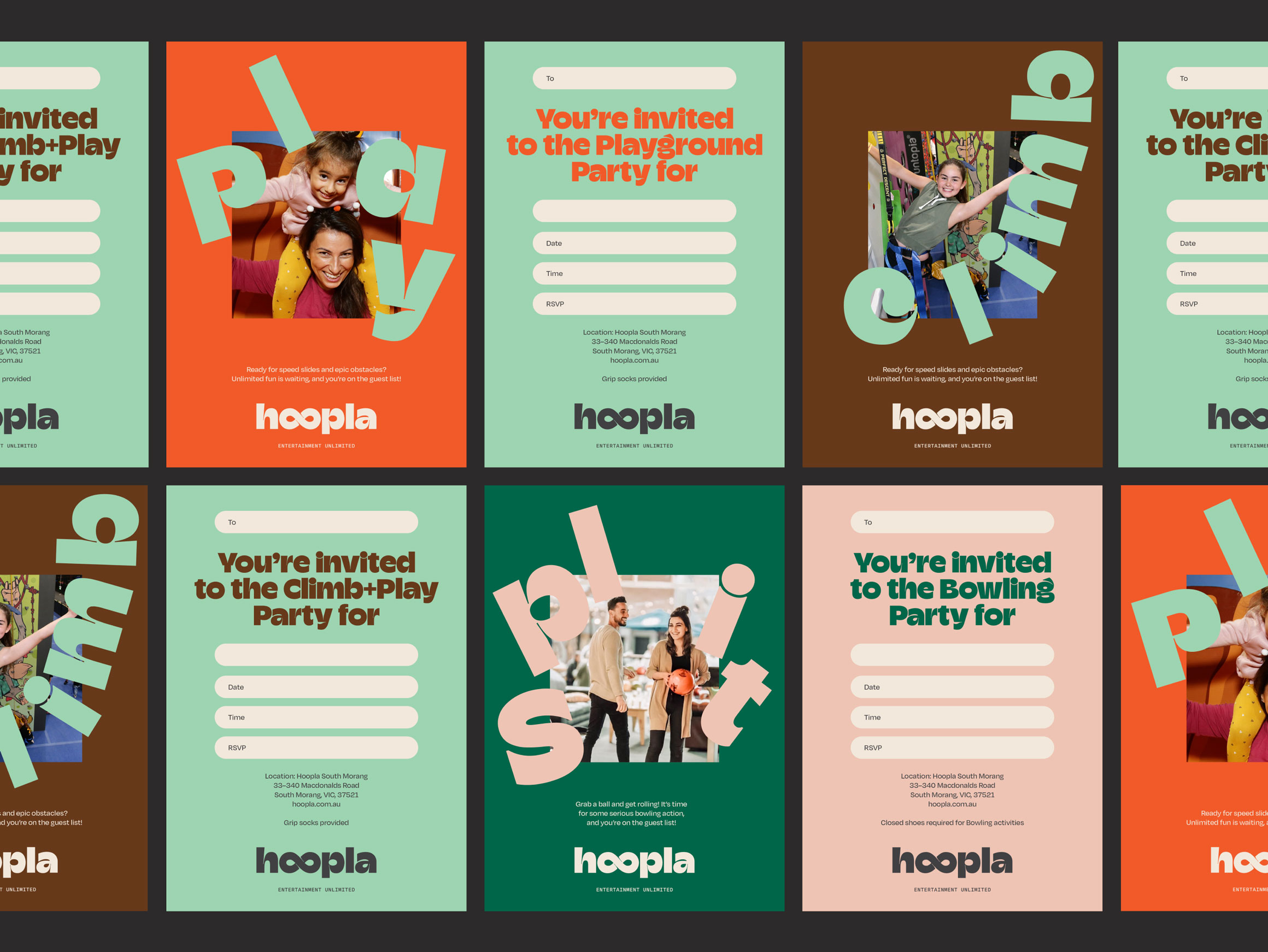
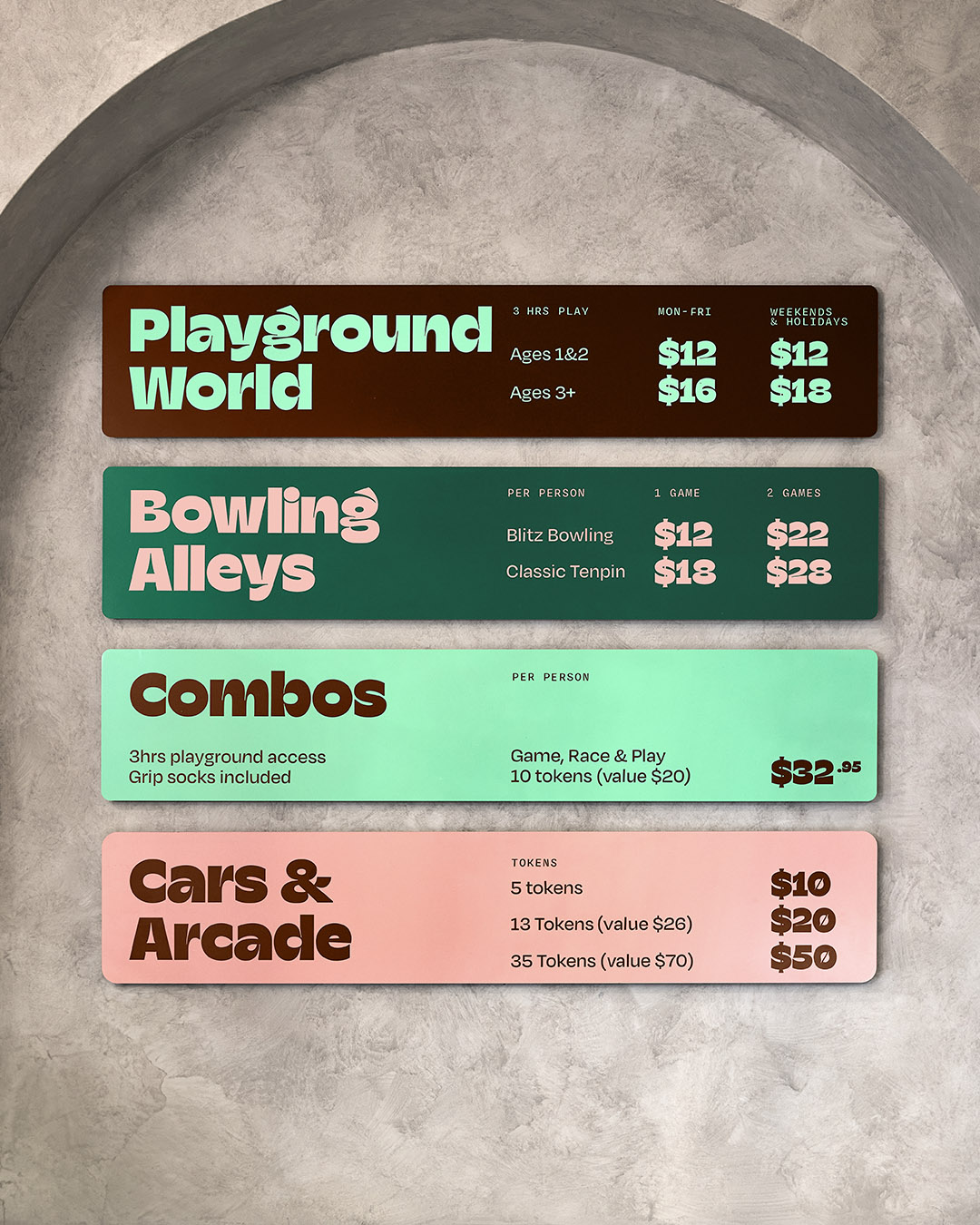
Hoopla are creating Australia’s largest interactive indoor playgrounds, offering expansive play zones, fully-enclosed toddler zones, traditional tenpin and blitz bowling, indoor rock climbing, arcades and a variety of other exciting activities, topped off by a premium food and beverage offering.
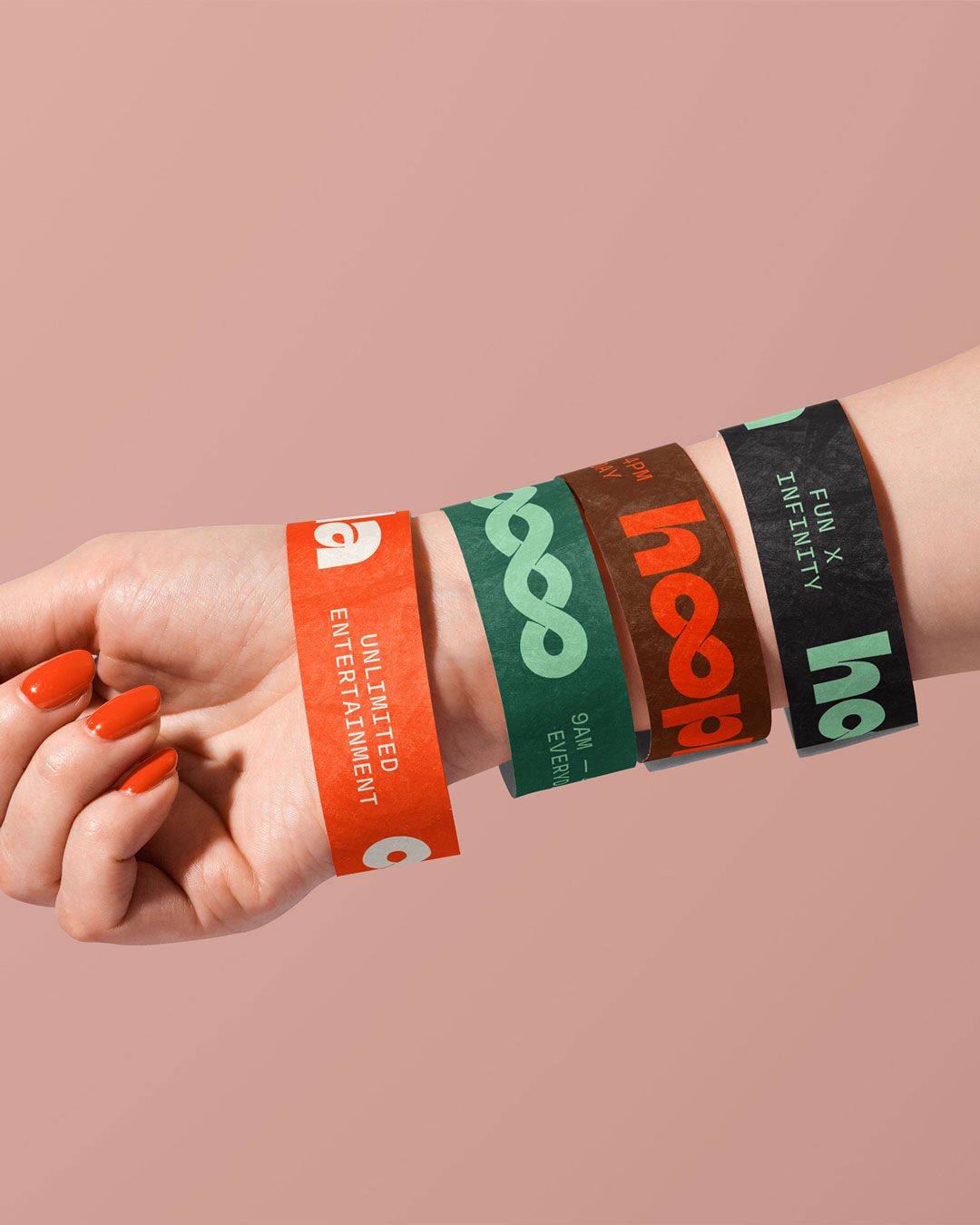
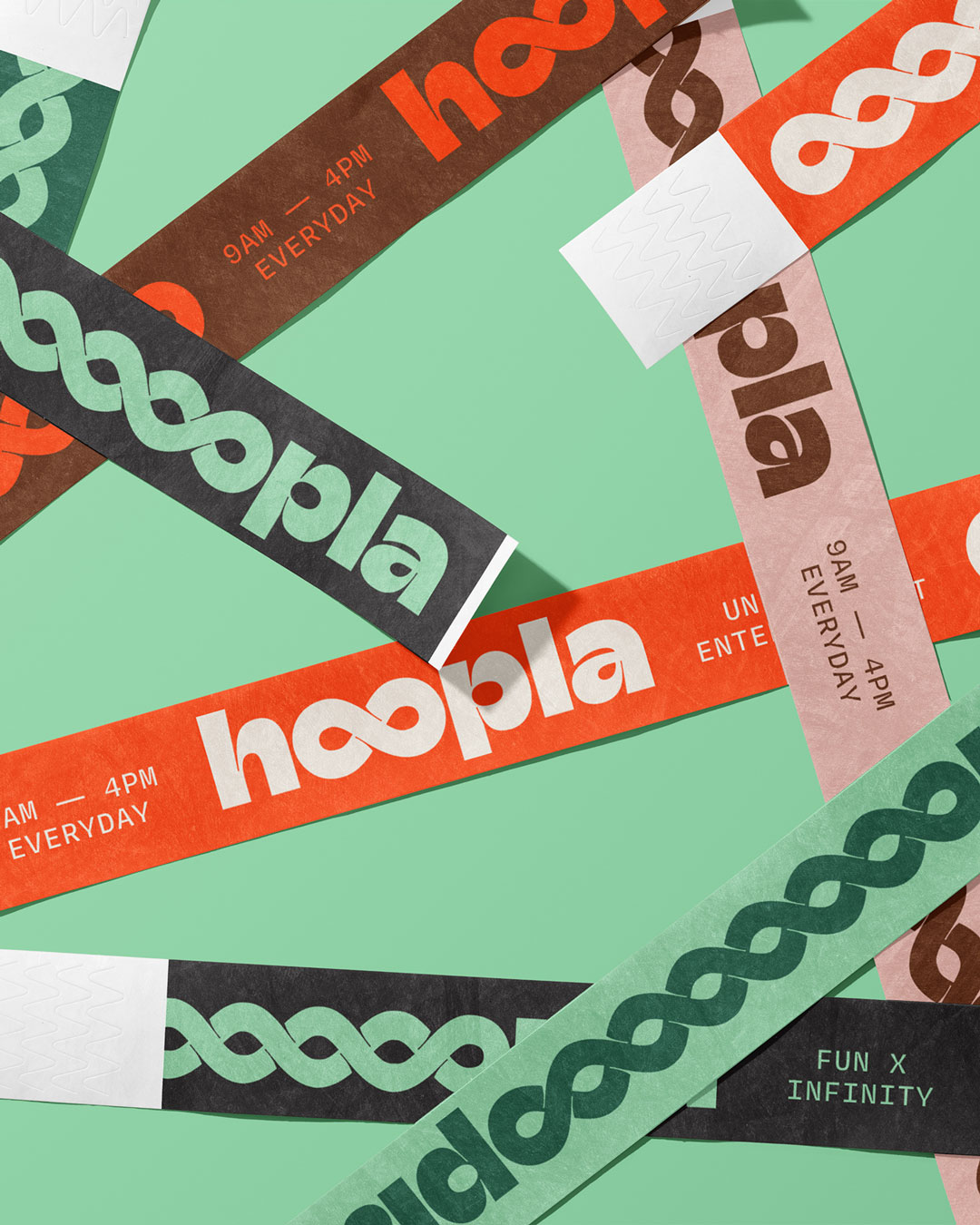
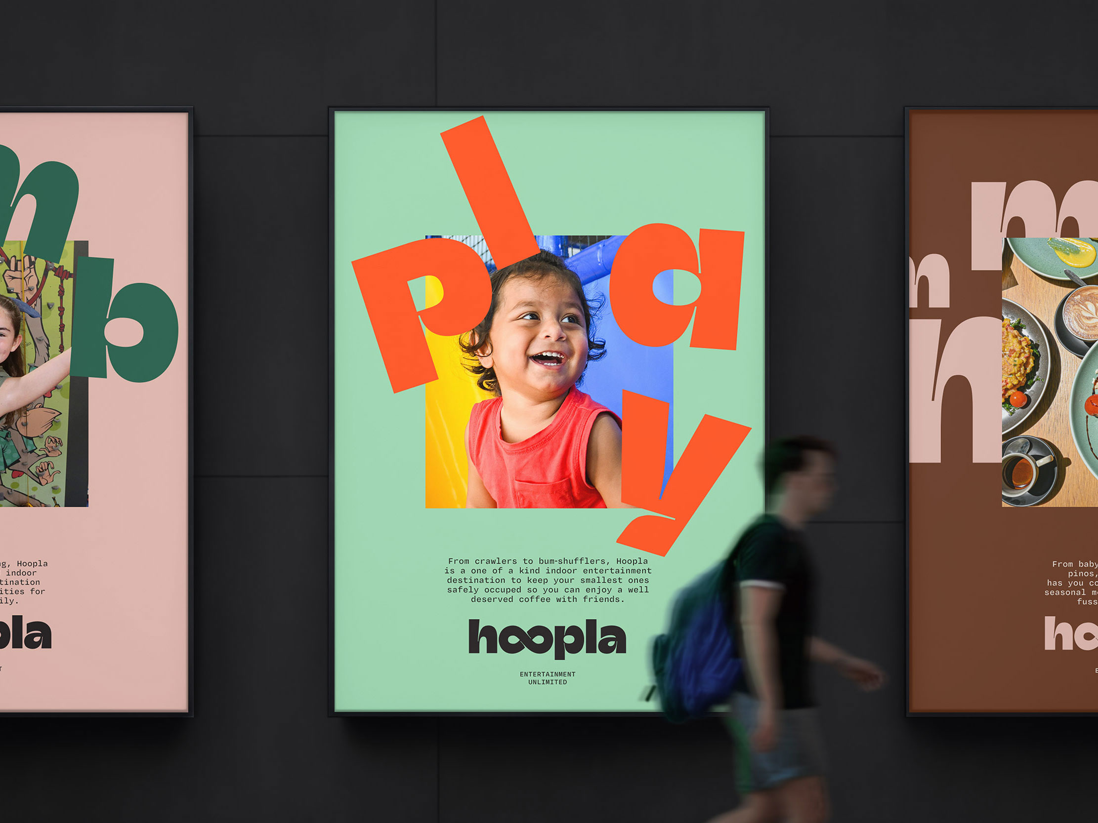
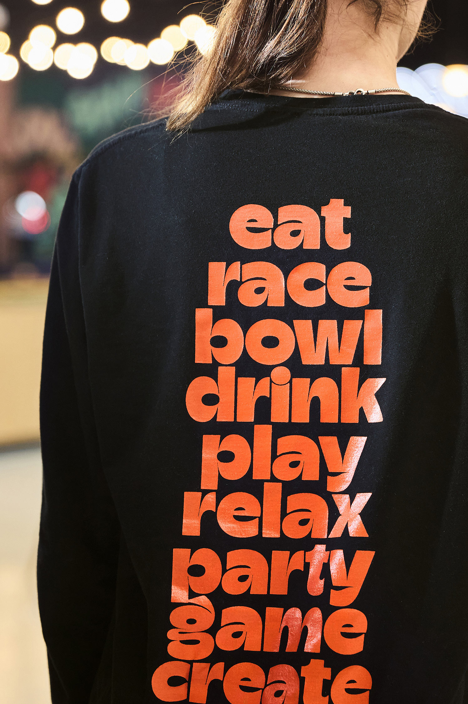
Hoopla means Entertainment Unlimited
The Brand Strategy process allowed us to identify that the breadth and diversity of activities is what makes the offer unique, which in turn led to the Self-truth® – ‘Entertainment Unlimited’.
With our North star in place, we began the often daunting process of Brand Naming, ultimately landing on ‘Hoopla’. Whilst the original french meaning (upsy-daisy) and the early english meaning (a noisy commotion) were both relevant, the fact the word is less common today, meant there was a chance to own and further define the term.
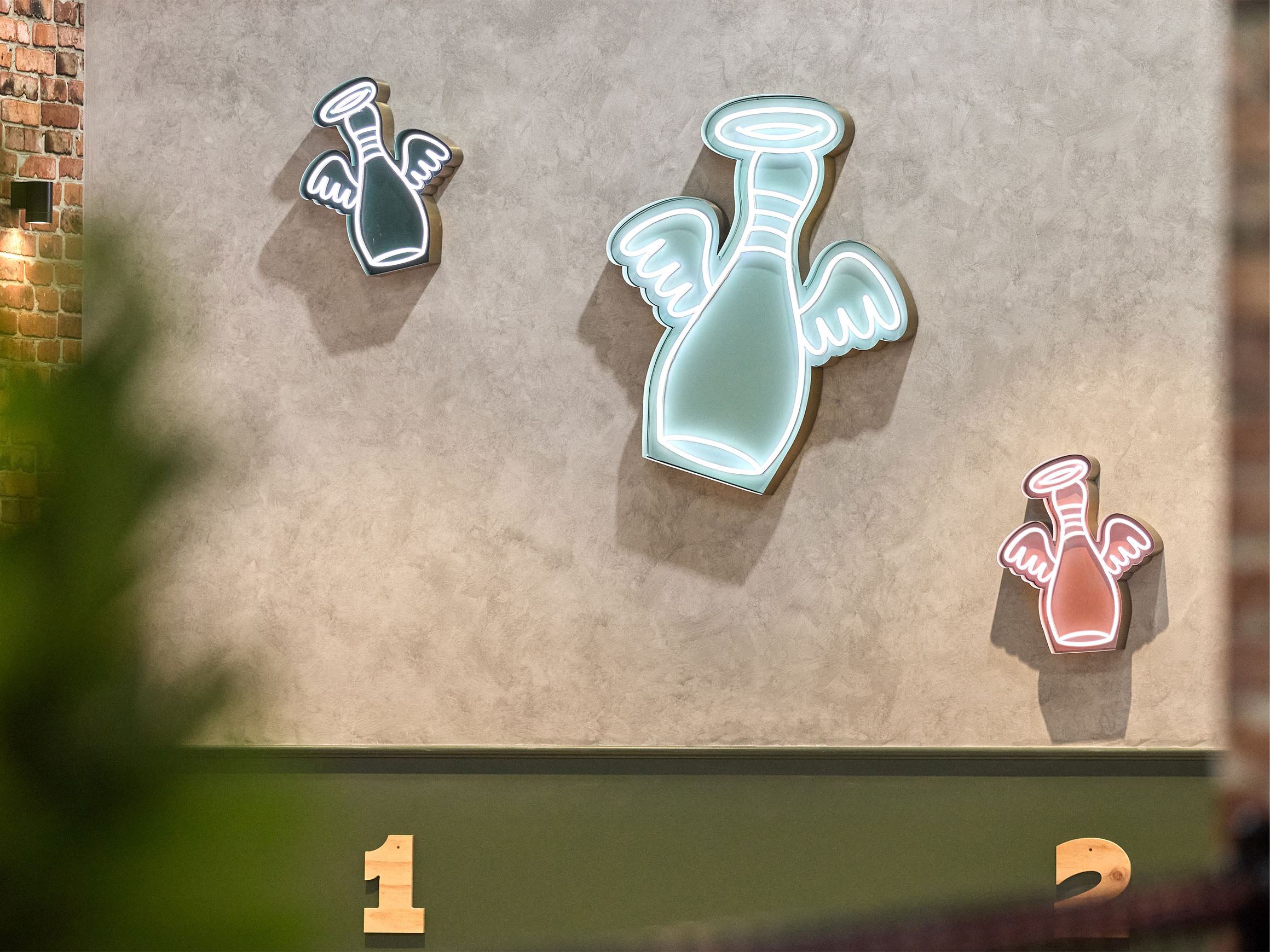
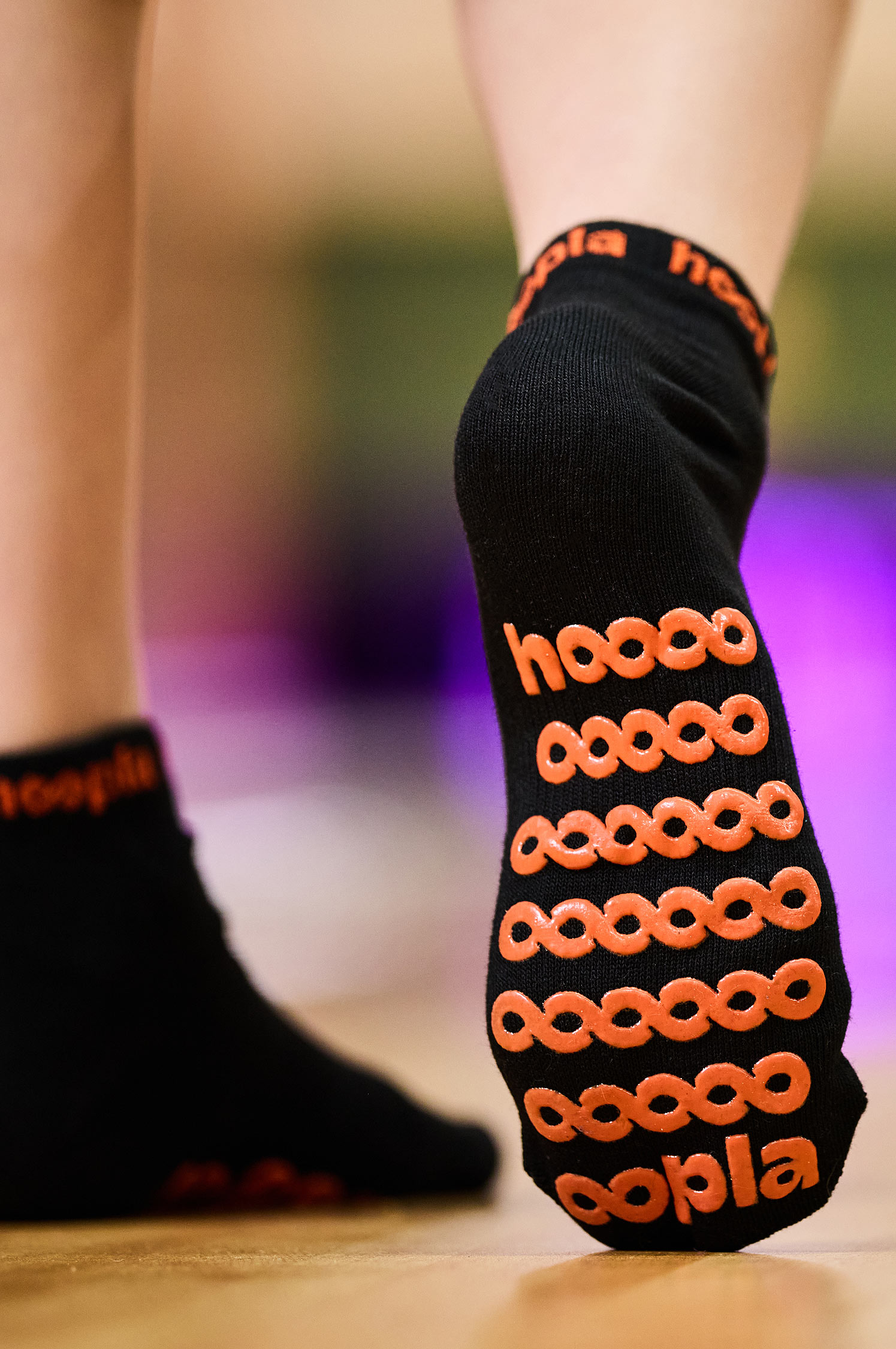
Infinite Fun
The notion of ‘Entertainment Unlimited’ is embedded directly into the logo as an infinity symbol, further emphasised with strong type-led comms, showing the continuous range of activities offered and the diverse family members we aim to engage.
Feeling words
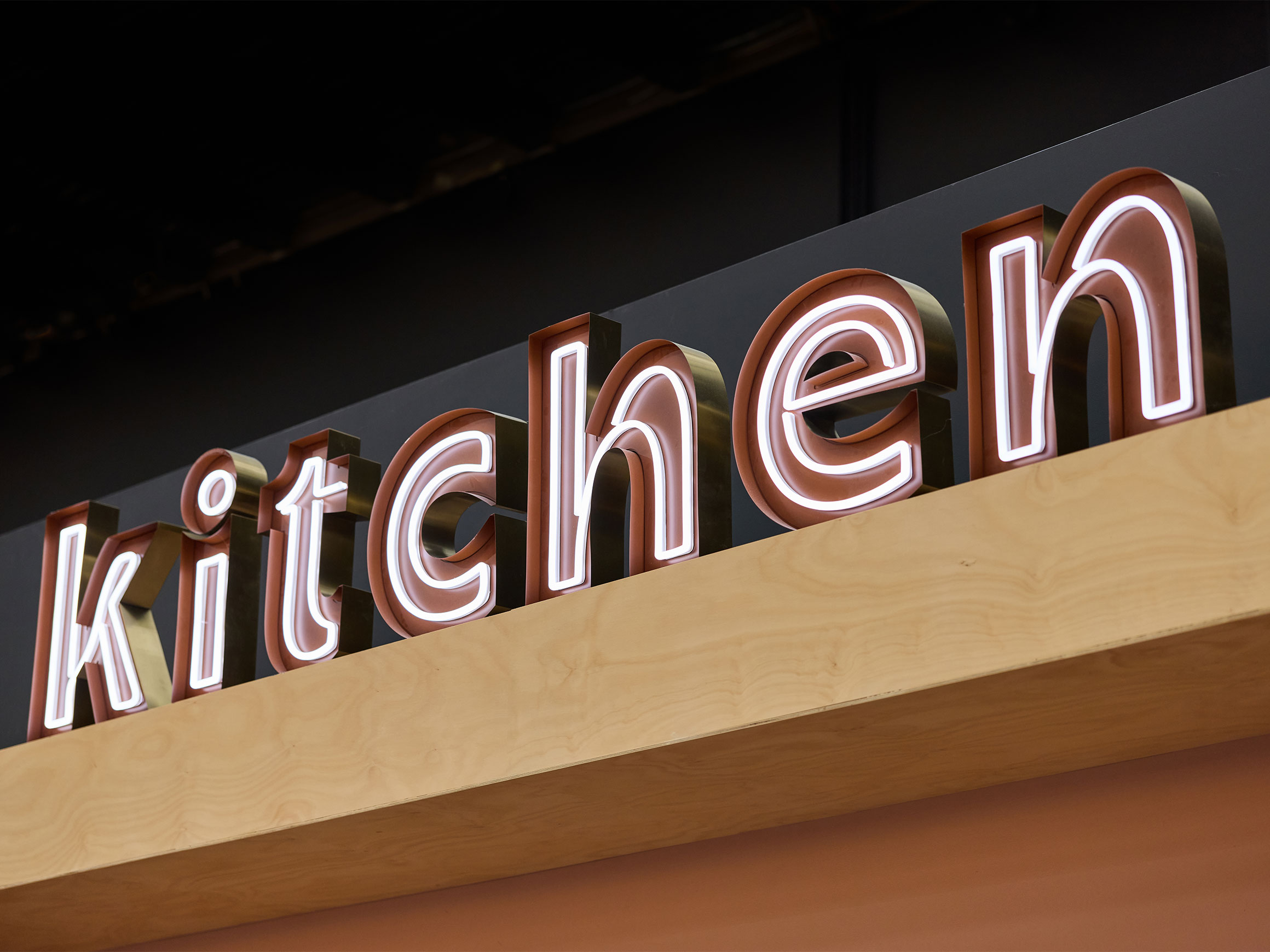
A single typeface, Champ, can say so much. It is full of character, and playfully joins customers on their journey, scaled up for impact, or dialed down for clarity. It’s versatile, playful, and adaptable, able to shift in tone to suit any context.


Putting the ‘fun’ in ‘functional’
With over 90% of users being on mobile — often while juggling multiple kids – the website was designed and built to have a big impact on small screens, balancing engaging UI and effortless UX.
We worked with the Hoopla team to refine the content plan and site architecture, then ensured a richly immersive experience, which seamlessly integrates the Roller booking system.
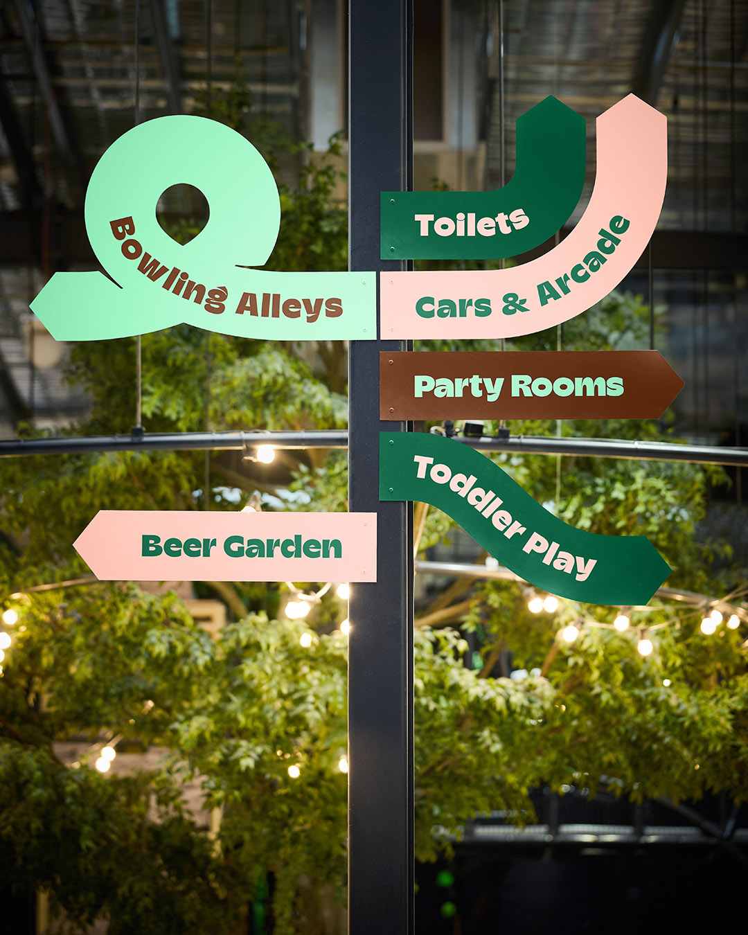
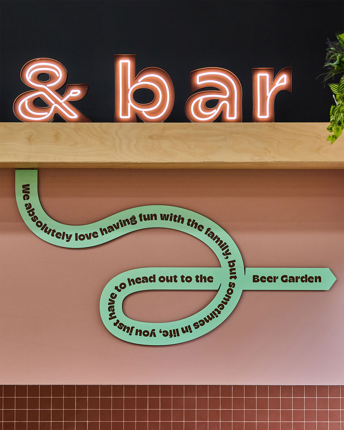
Getting physical
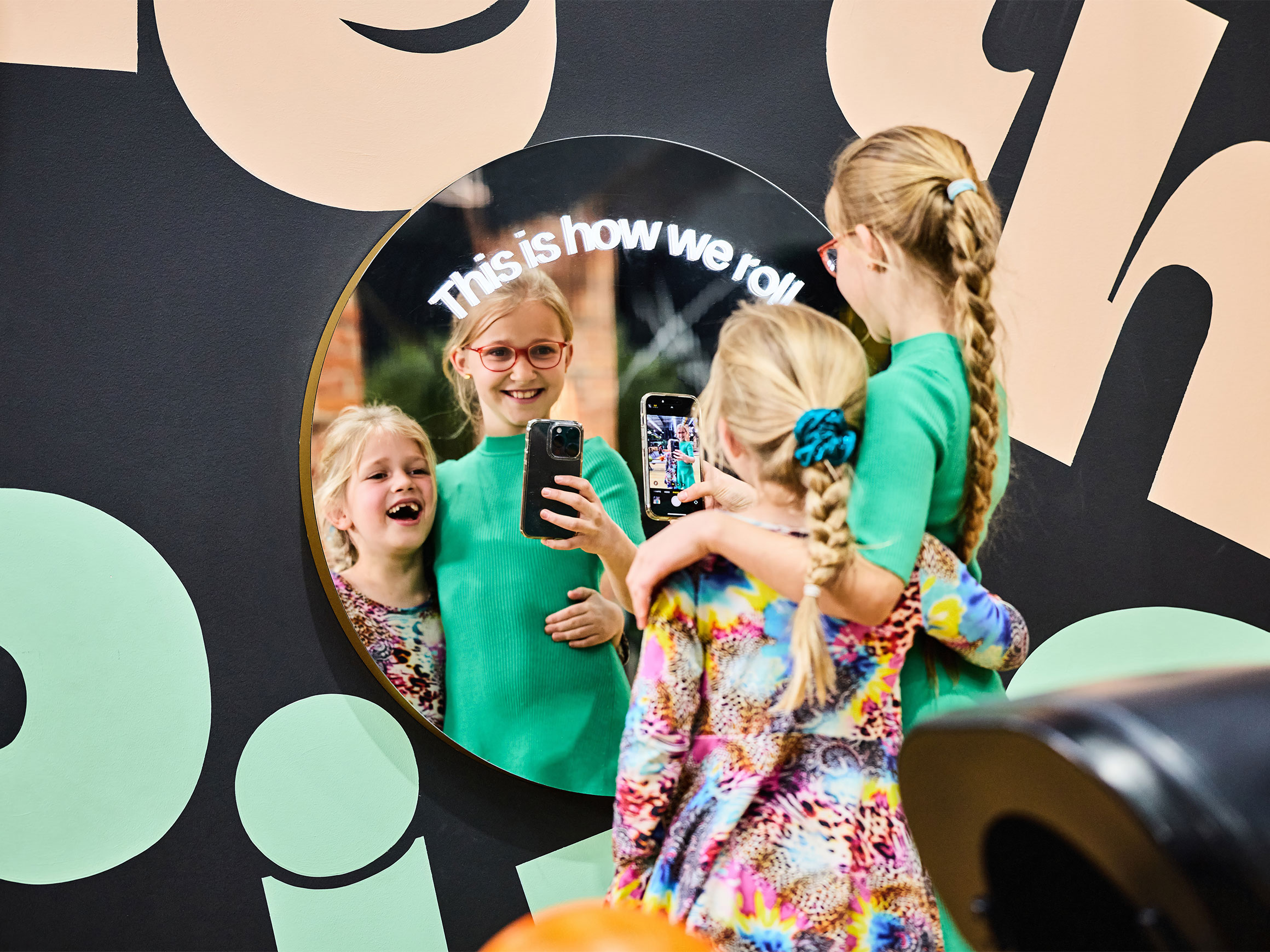
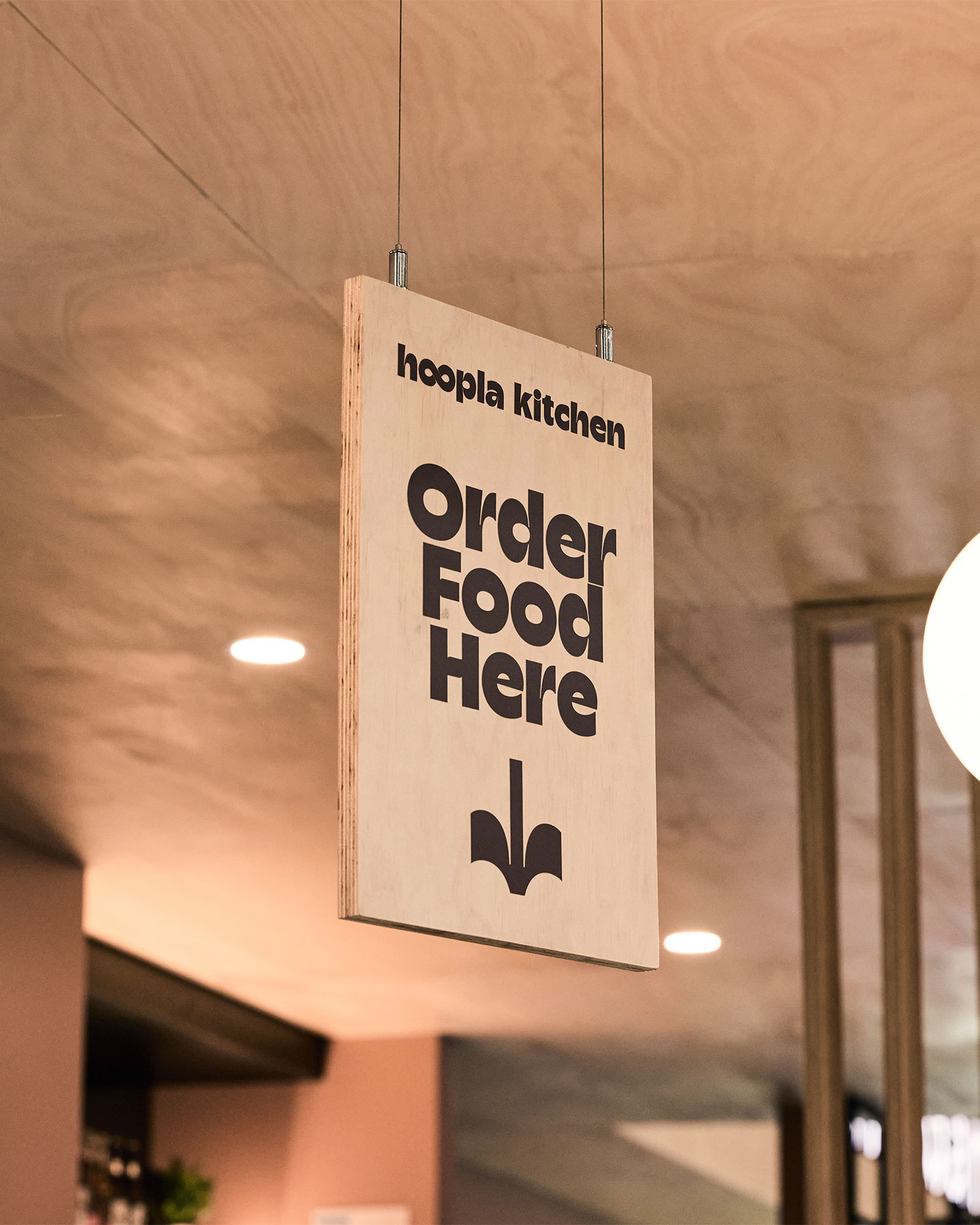
The physical expression of the brand takes place in the form of fabricated 3D signage, playful wayfinding, hand-painted murals and environmental graphics.
Building upon the interior design by 2M Creative these elements harness the colour palette adding a fun and interactive layer.


Our brand and naming structure were quite undefined, and the team brought a lot of clarity and direction to that, which has had a lasting impact on how we position Hoopla.
The end result exceeded our expectations and delivered a brand that felt considered, distinctive and true to the vision.
Leo Neophytou, Director, Hoopla
Credits
Jake Smallman
Paul Monkivitch
James Yang
Andy Giddings
Phoebe Dann
Marcus Bichel
Owen Davey
Leo Neophytou
Mikayla McDonnell
2M Creative, Interiors
James Geer, Photography
Typefaces
Related Projects
View case studies by sector or service