inkl
Good News
inkl
Good News
Challenge
inkl is a news subscription service founded in 2014 by Gautam Mishra.
The app was dubbed ‘Spotify for news’ as it provides access to news from over 100 of the world’s best sources through a single subscription. No paywalls. No ads. No clickbait.
Not only is inkl a cost-effective and convenient solution for readers, it’s also a new revenue model helping traditional publishers transition to digital publishing.
inkl had secured deals with many of the world’s best publishers and was looking to substantially grow their readership in order to secure further funding.
While the app worked effectively, there was a complete lack of brand personality, or as Gautam descibed it, “the brand had a head but no soul.”
Solution
Through in-depth research, competitor analysis and a brand audit we realised that inkl’s strength related to the quality and breadth of their sources, and the curation of this content through a combination of algorithms and journalists.
The brand platform ‘Illuminating Information’ inspired the logo’s orange tittle which comes to life as an animated spotlight. This formed the basis of the visual approach, including digital ads which reflected the multiple view points inkl provides on every news topic.
Seamlessly blending brand and UI
The original website looked very different to the app. The app looked and functioned differently on phone, tablet and desktop. The Morning Edition and Weekly Wrap were again stand alone designs.
Brand extension
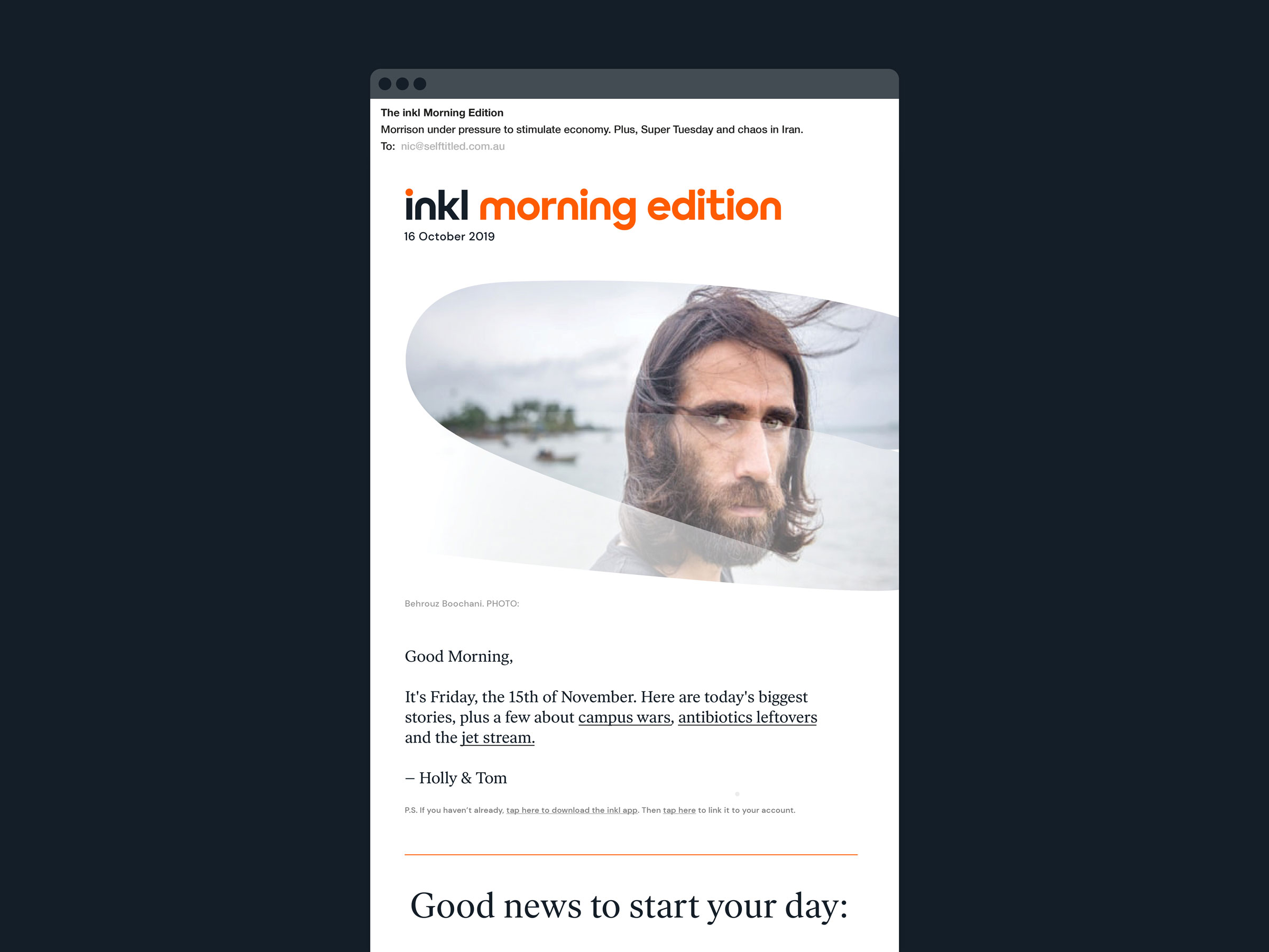
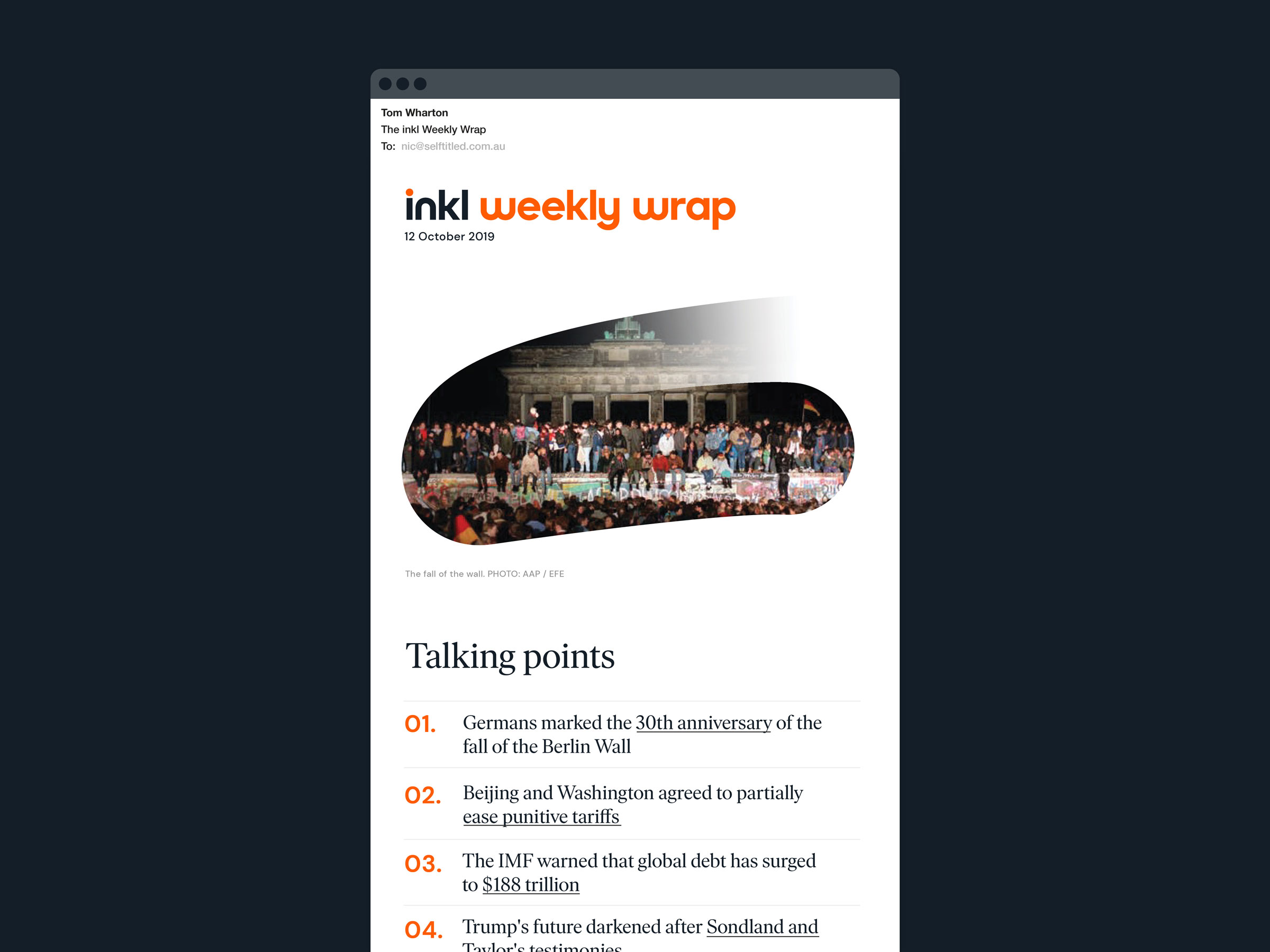
Aside from curating news from trusted global sources throughout the day, inkl also publish a daily and weekly review via app and email which cover the most important stories, as well as positive (Good News) and unexpected stories. inkl also directly commissions journalism under the banner of inkl Originals.
Some readers consume most, or all, of their inkl content directly from these emails, so they are highly significant brand touchpoints. We designed mastheads to signal the importance of the inkl Morning Edition, inkl Weekly Wrap and inkl Originals as well as the design of the emails themselves.
Illustration
Two types of illustration were developed to add visual interest across communications. The first uses the inkl spotlight to highlight functionality in marketing and tool tips.
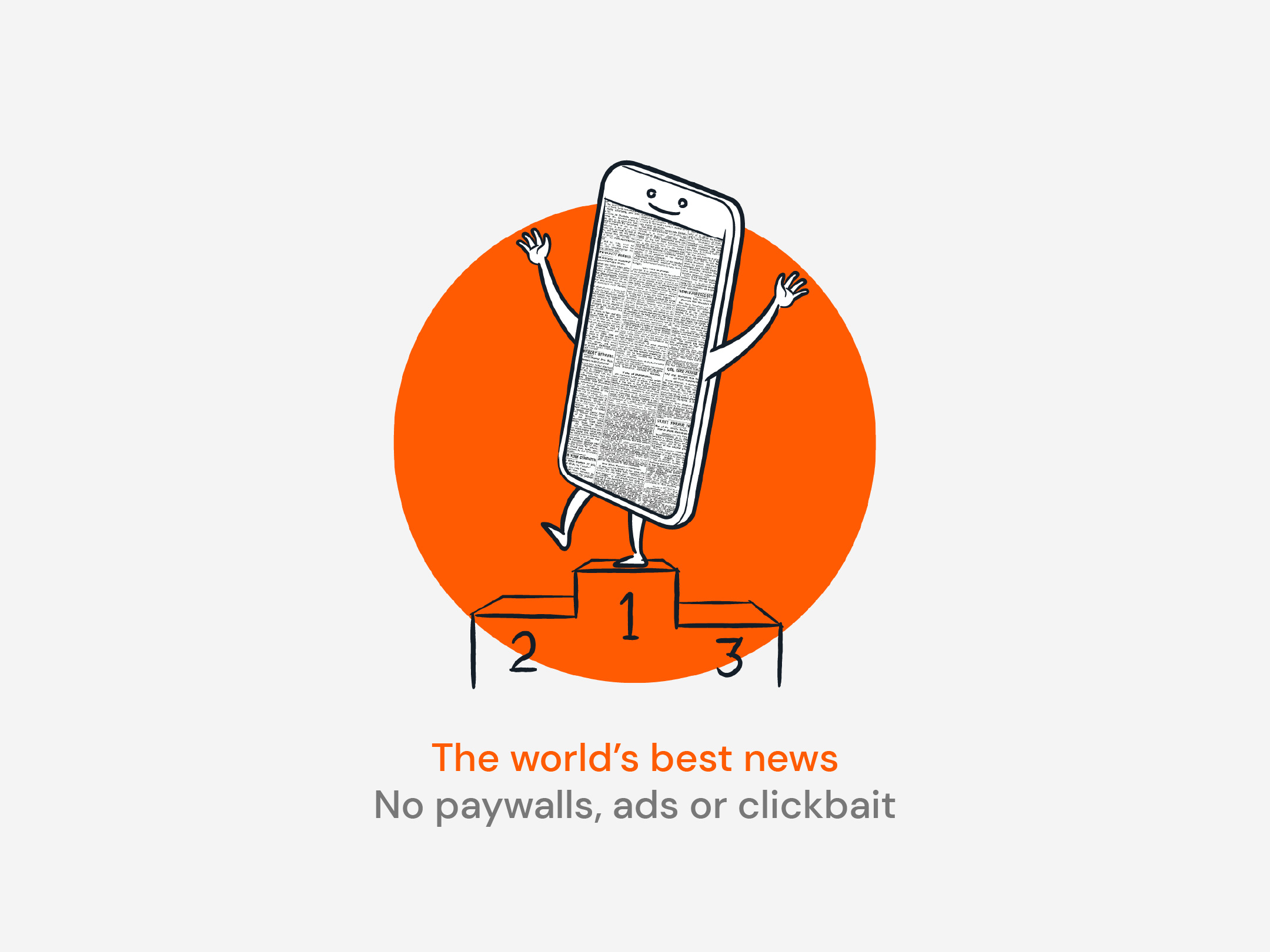
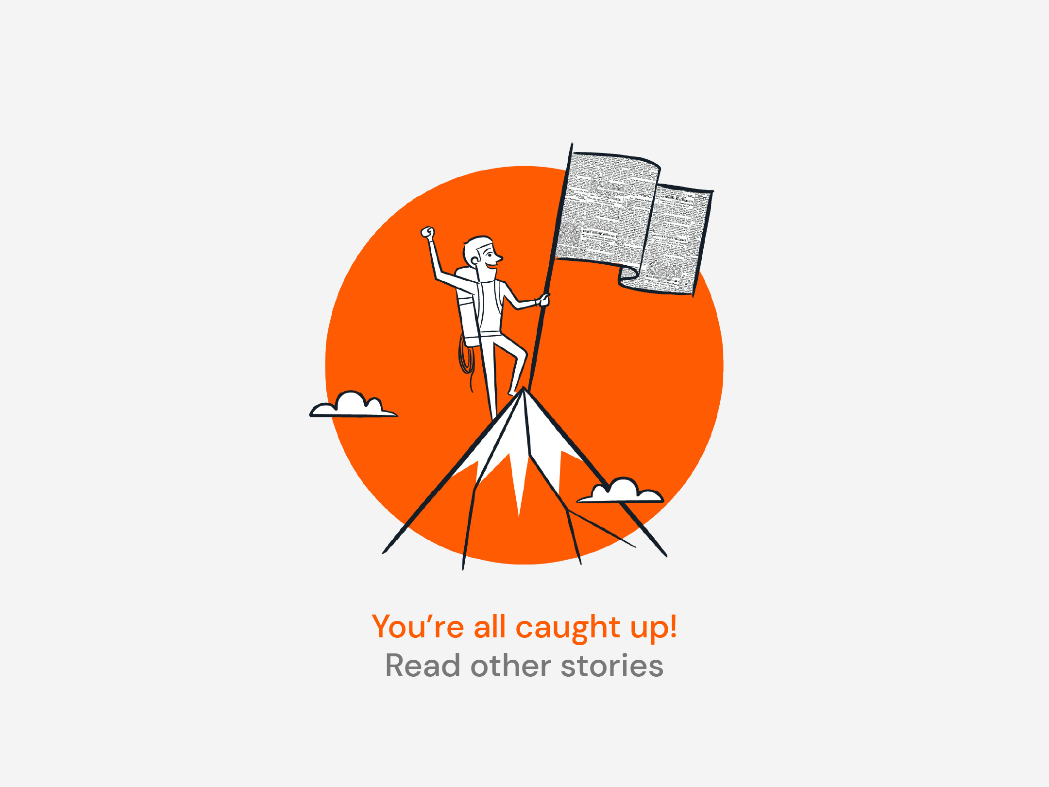
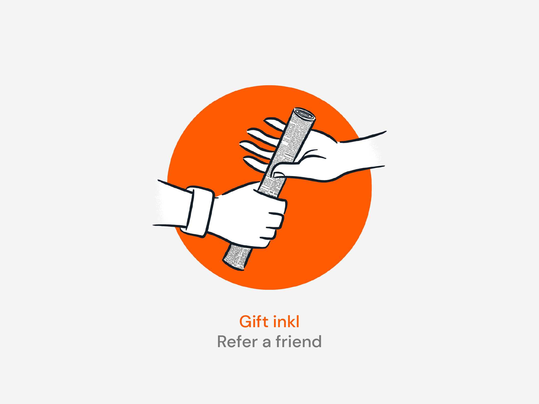
The second type of illustration, by Ben Sanders, uses the printed newspaper as a design trope to add some much needed personality to interactions throughout the user experience.
Results
Since the rebrand launched in early 2020, inkl has experienced a continual rise in memberships with 6% month-over-month growth in revenue.
“We had high expectations for Self-titled, but even so, they continually surprised us with the level of detail, thoughtfulness, creativity and commitment they showed to our project.”


