Sa Dot Na
Avant-garde aesthetic
Sa Dot Na is the fashion label of designer Bronwyn Nicholson. Meticulous tailoring, sharp silhouettes, deconstructed forms, exquisite fabrics and androgynous designs combine with a black colour palette to create the distinctive and dramatically avant-garde aesthetic.

Solution
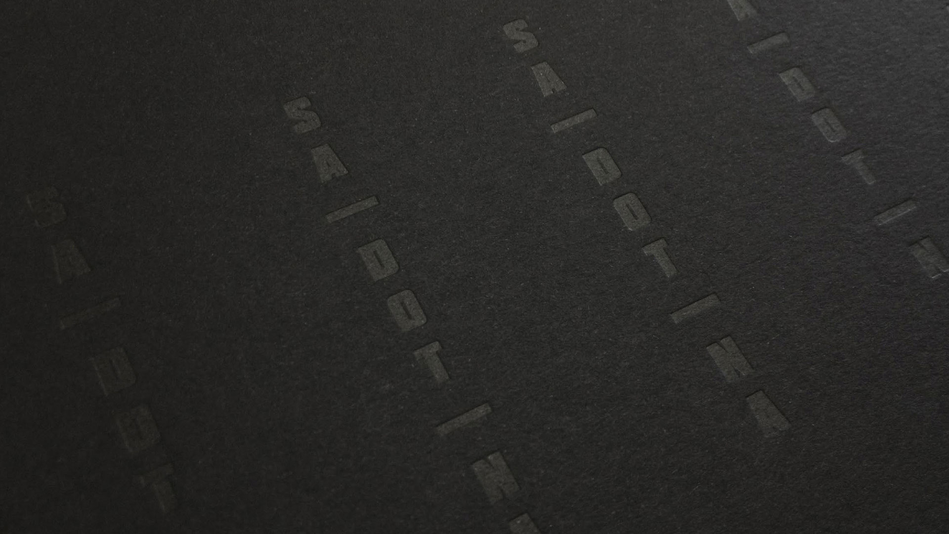
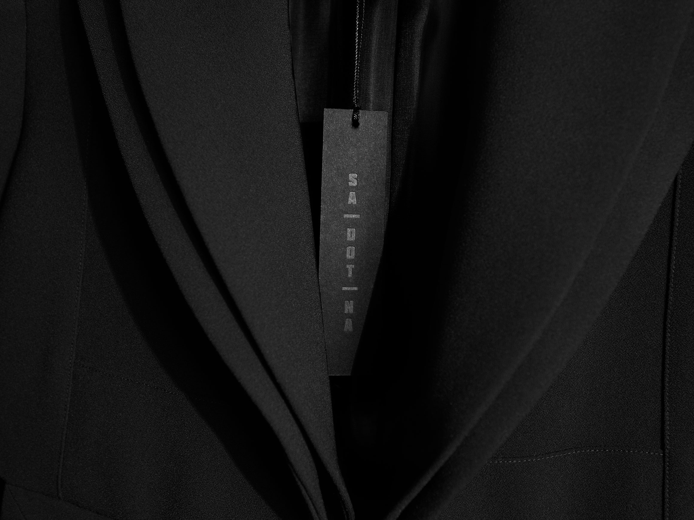
During early discussions with the client, the appreciation of contemporary Japanese design and the accompanying imagery was identified. Japan’s vertical typography was drawn on for the design solution, and the name broken into three single syllable words. Directly referencing the tonal blacks Sa Dot Na employs in their fashion, new collateral was realised in subtle black letterpress on black paper stocks and laser-cut gift wallets.


Results
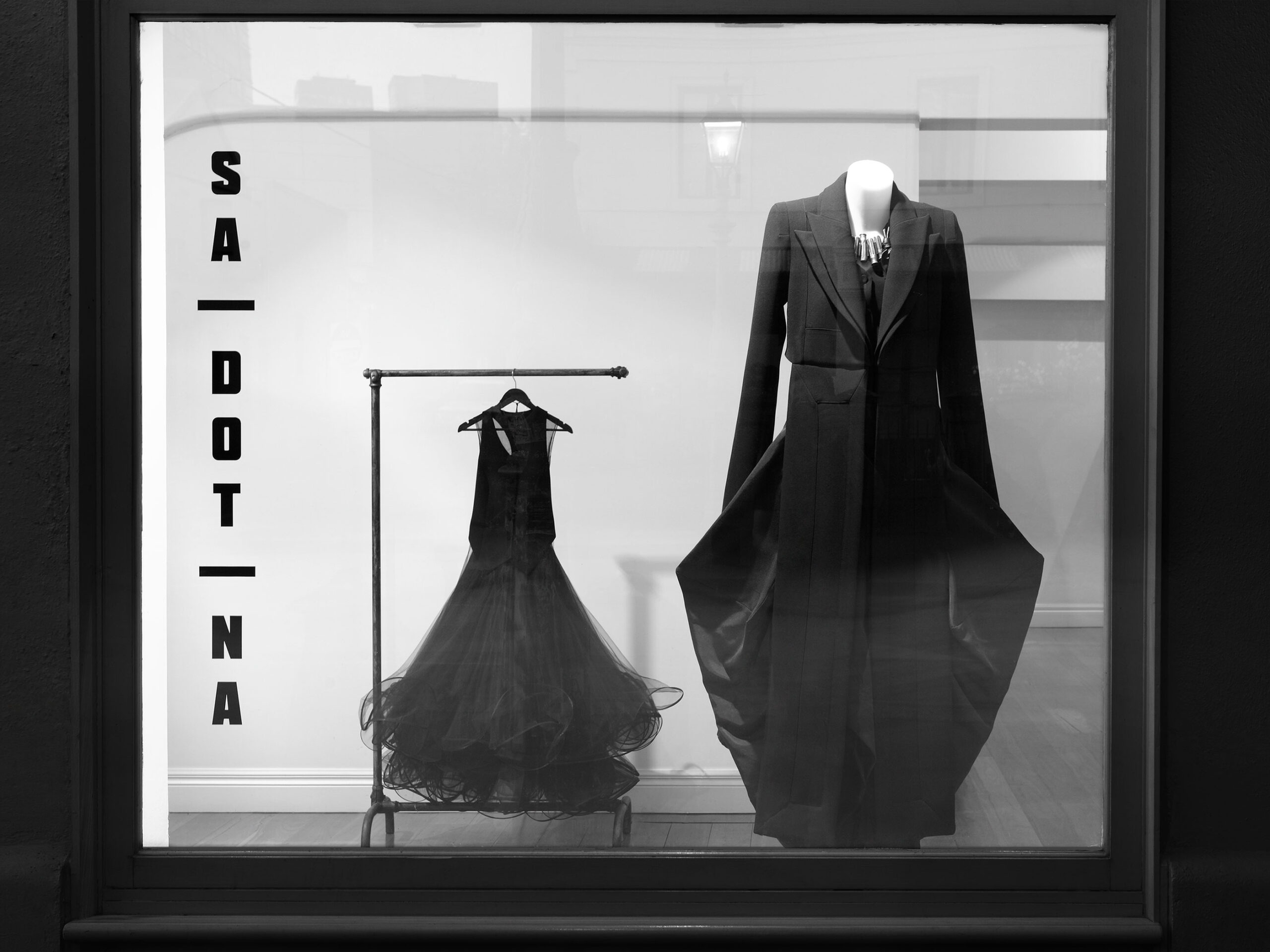
The new brand identity perfectly reflects the fashion label’s aesthetics, quality and service, increasing the prestige of the in-store transaction, and reflecting Sa Dot Na’s care and attention to detail.


Credits
Jake Smallman
Related Projects
View case studies by sector or service