Opticity
See the city in a new light
Opticity
See the city in a new light
Challenge
As a company delivering street lighting upgrades across Australian cities, Ironbark Sustainability developed a portal for managing their public lighting projects.
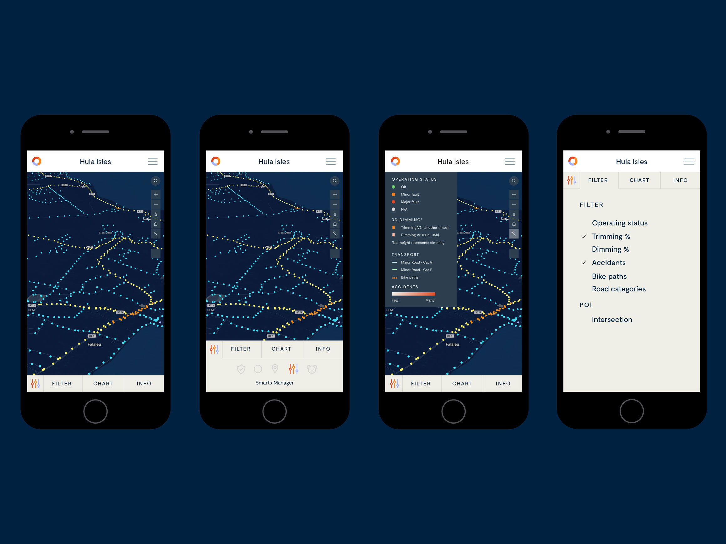
The map-based tools give a real-time snapshot of lighting assets including location, condition, lamp type, dimming schedules, and faults.
Although the current product is lighting focused, the product will eventually be able to receive data from smart city sensors of all kinds and enable some remote and automated control.
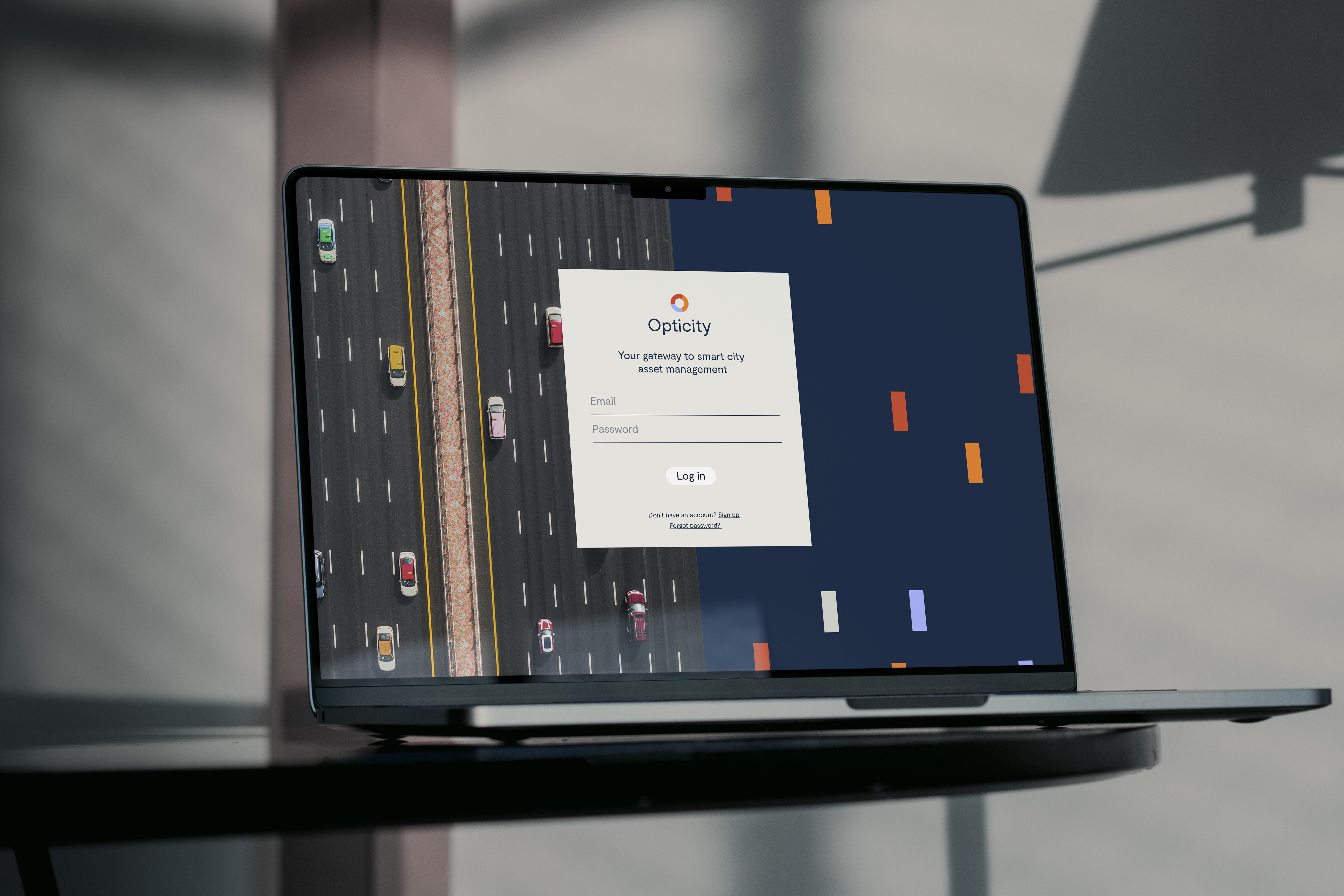
In order to successfully transition from in-house tool to commercial platform, Ironbark required an ownable brand name, a distinctive visual identity and an attractive and easy to use UI approach.
Solution
With benefits beyond sustainability, we positioned it as a ‘street smart’ product empowering councils to make informed decisions.
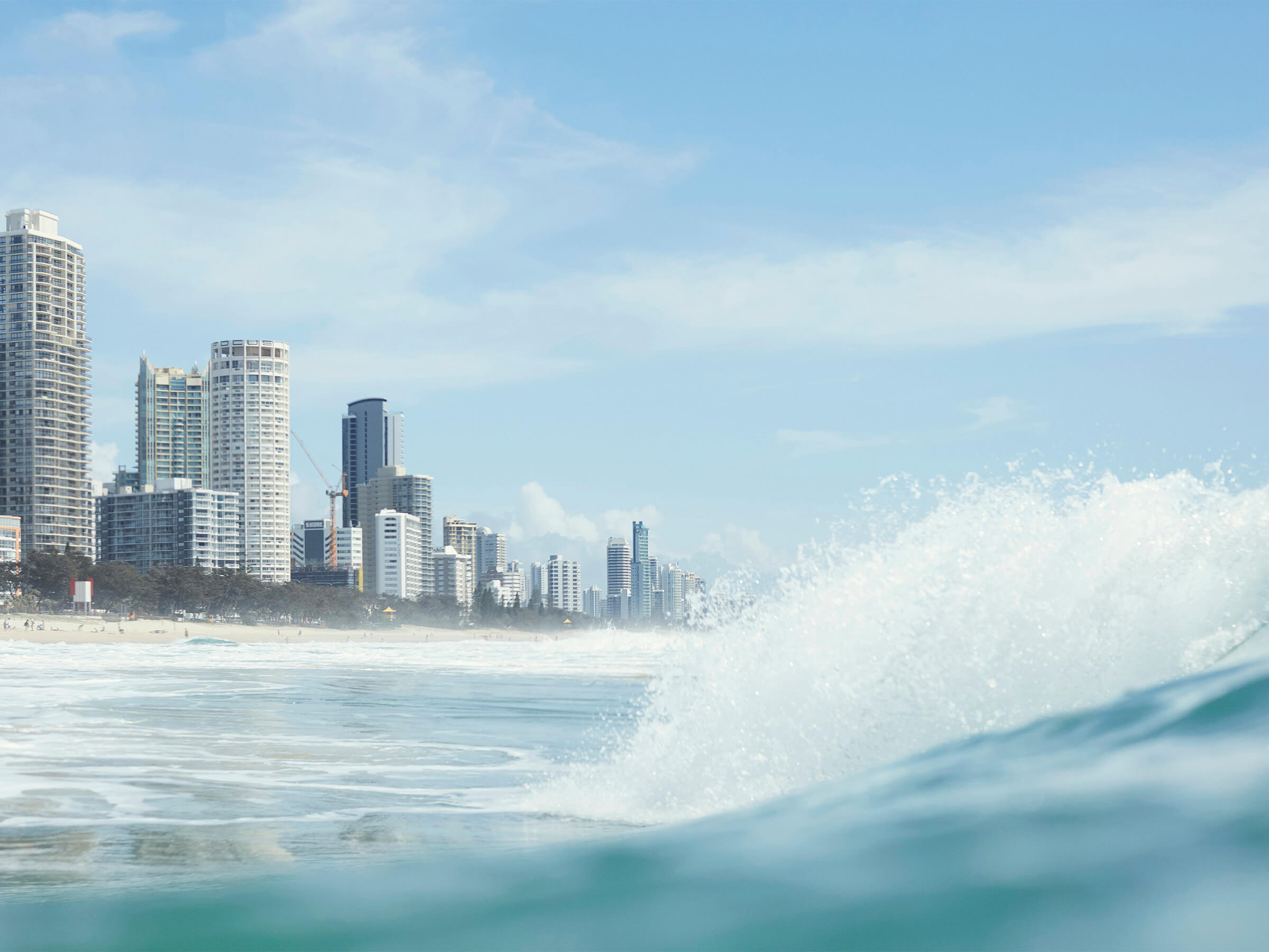
The future goal for the platform is the ability to optimise cities, which led to the name – Opticity. The visual language further extends this idea with graphs and cities juxtaposed side by side.
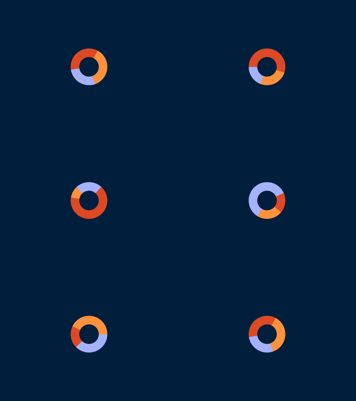
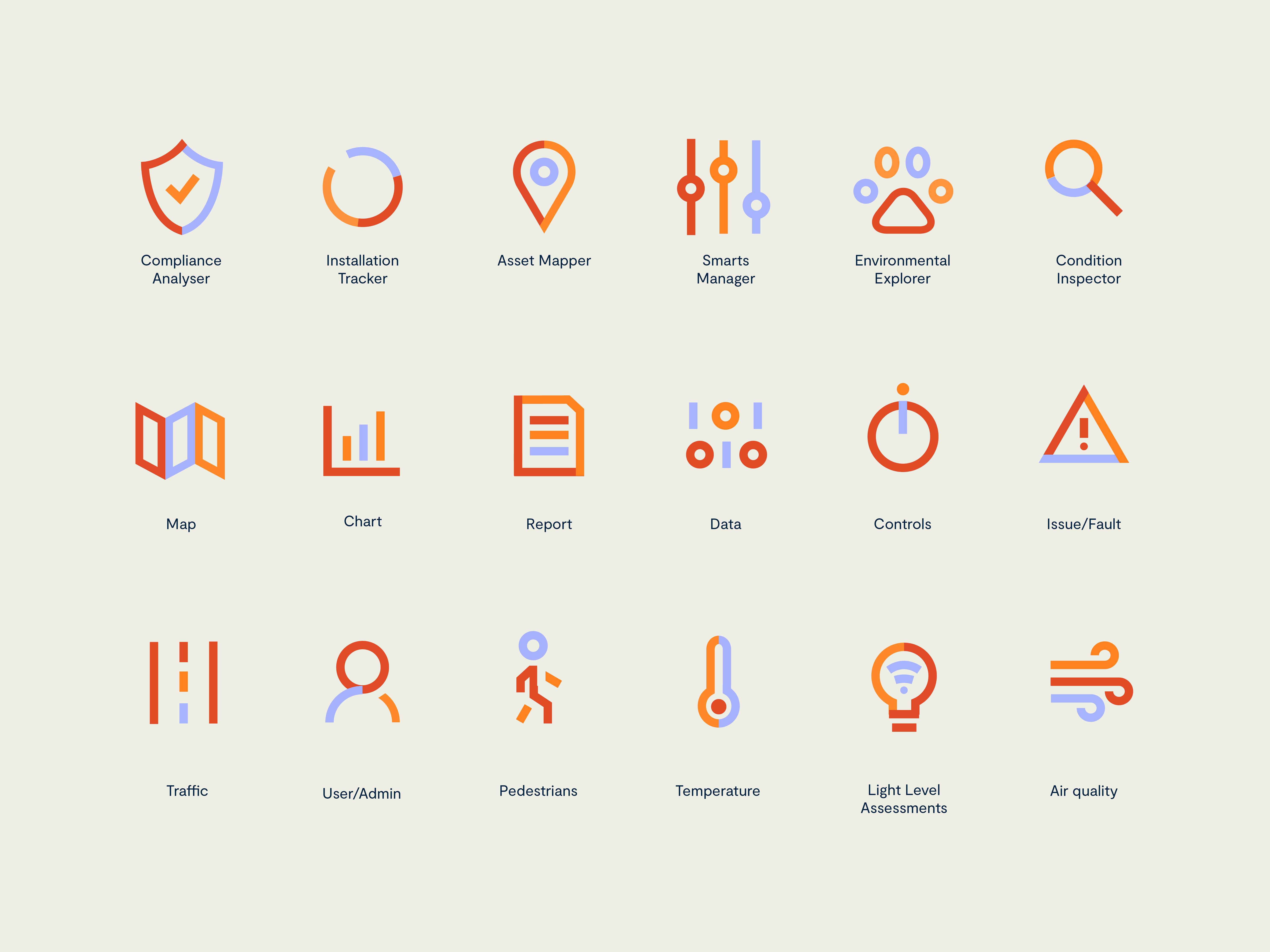
The logo features a stylised ‘O’ based on animated donut graphs which in turn informs a series of icons to depict the five key tools.
Self-titled enhanced the UI across desktop and redesigned it to function across tablet and even on smart phone.
A data-driven toolkit for smarter communities
When it came to app design we moved beyond ‘best practice’ to balance user experience with brand expression.
The tools, which utilise the Mapbox platform, were restyled, enhancing the existing desktop UI.
Self-titled then extended the interface to function across tablet and even on smart phone.
“Working with Self-titled was a great experience - they listened closely to our needs, let us steer at the right moments and delivered a great brand and product design.”
