Celebrating a decade of smarter branding
Anniversary exhibition
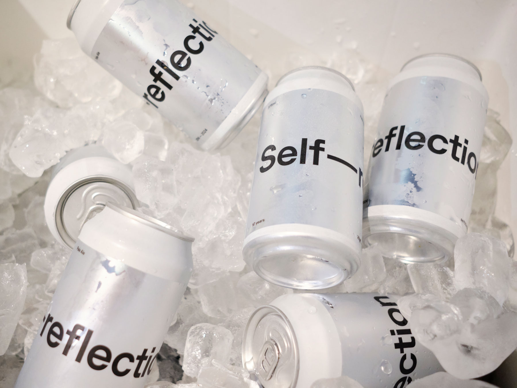
This year marks a decade since we started Self-titled. Since 2014 the studio has worked hard to deliver smarter branding that’s allowed us to share in our clients’ success.
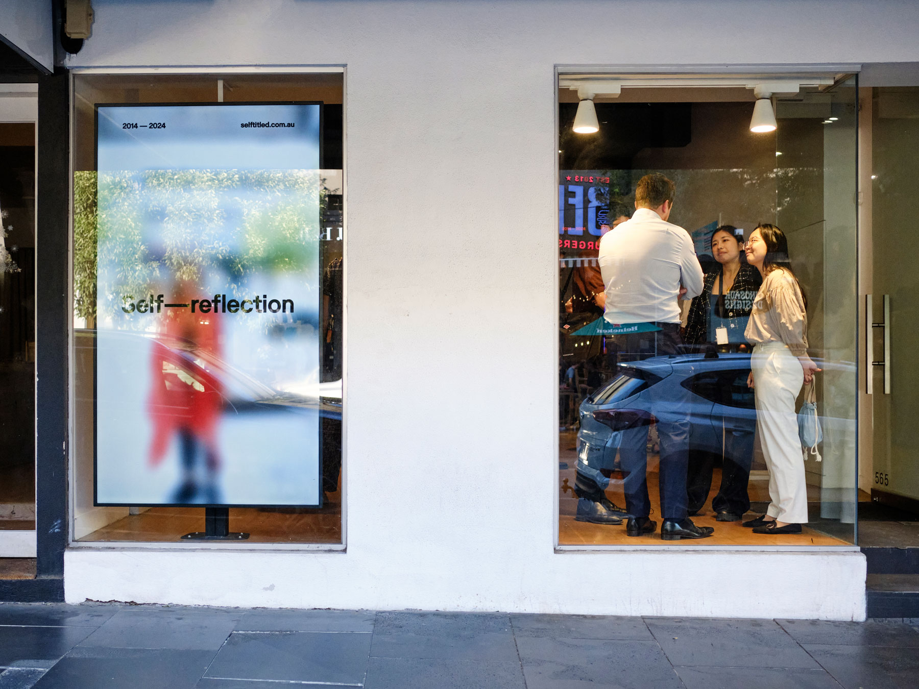
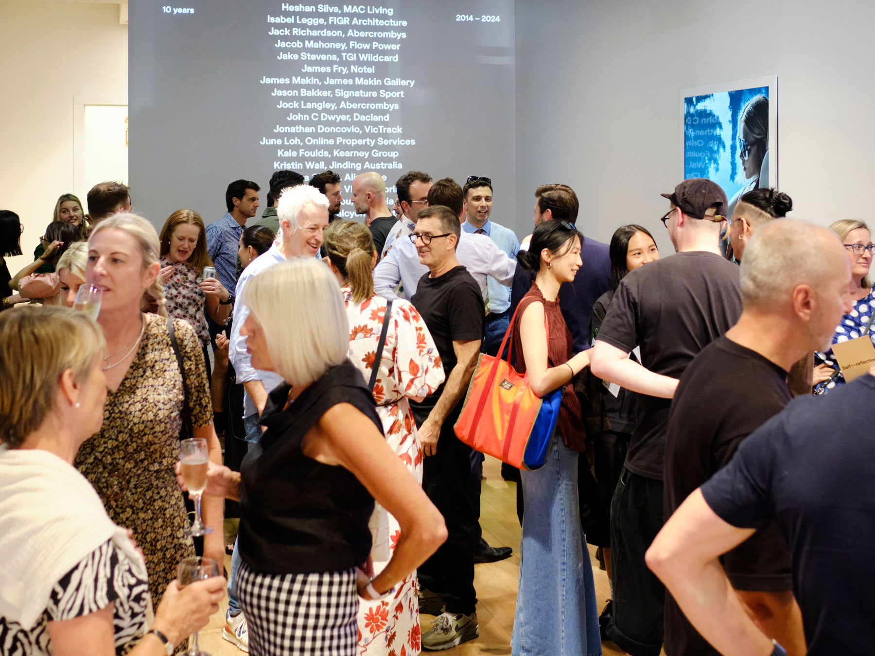
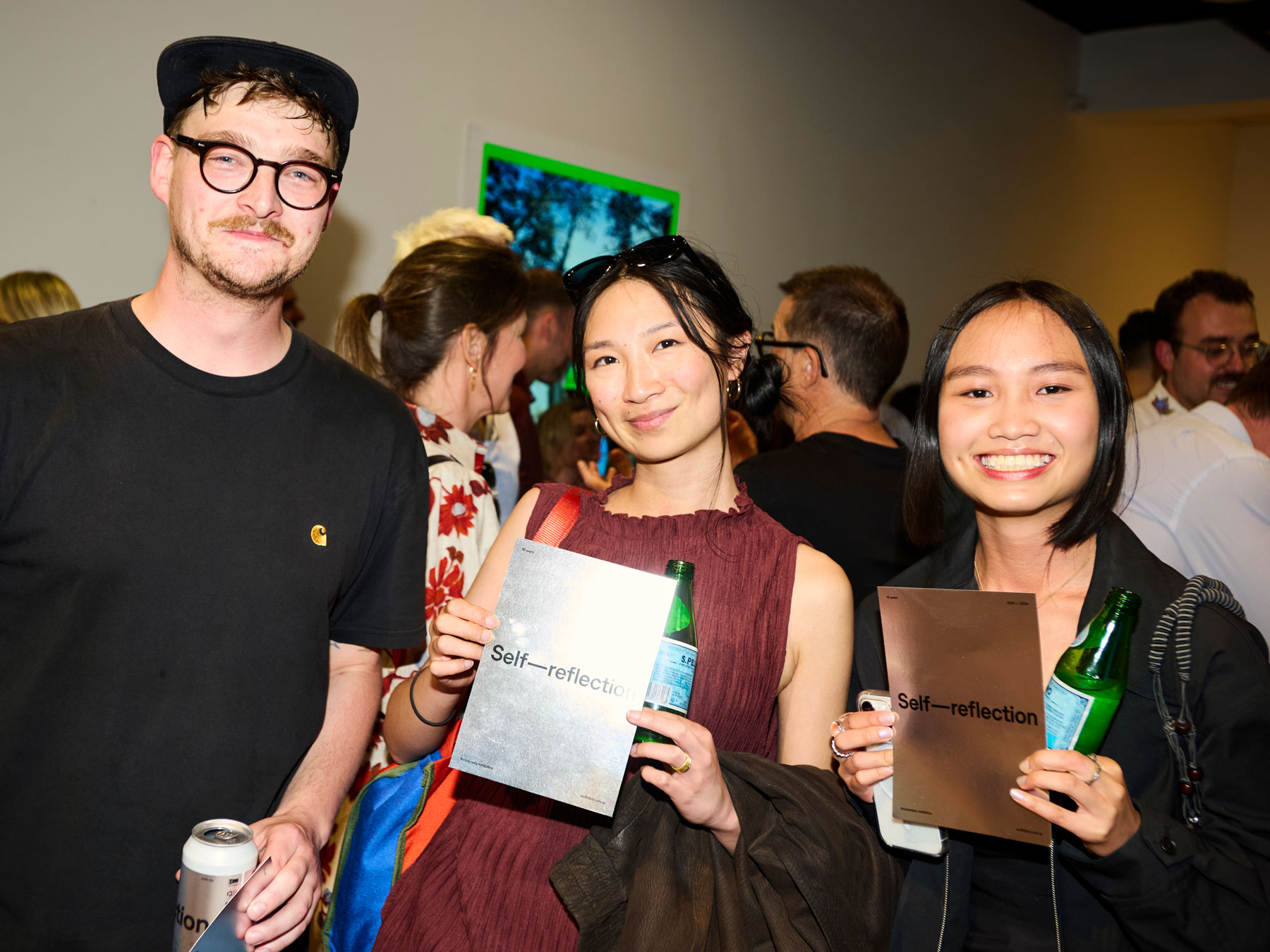
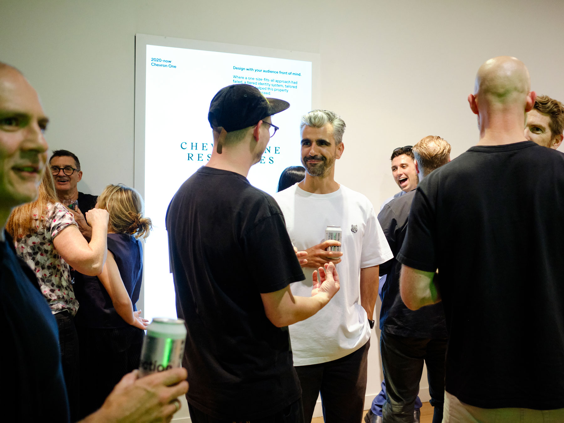
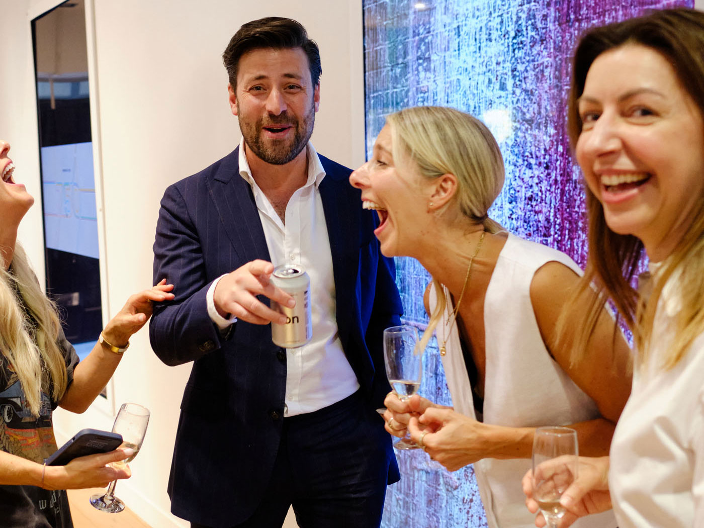
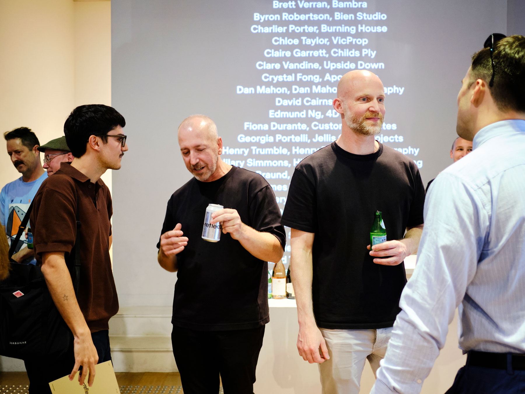
On Thursday 21st November, we celebrated the journey of the last ten years with a one-night exhibition on Chapel St reflecting on what we’ve learnt along the way.
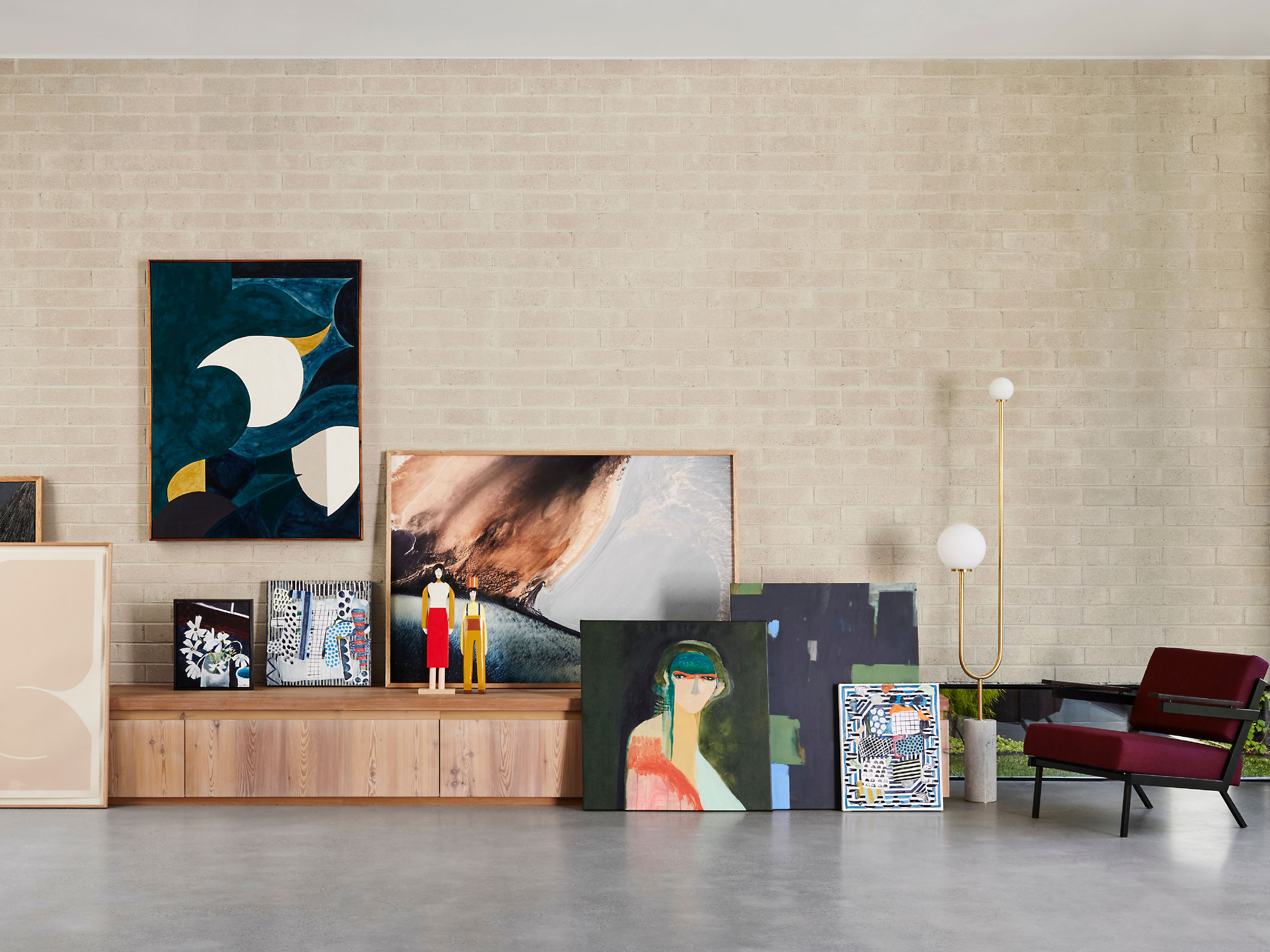
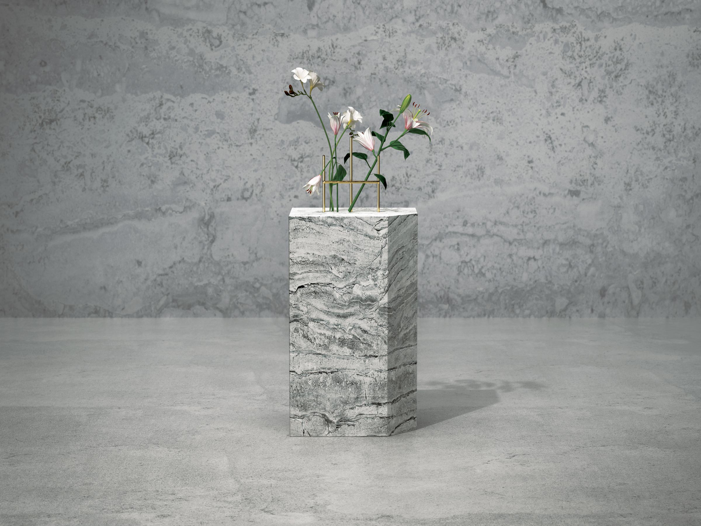
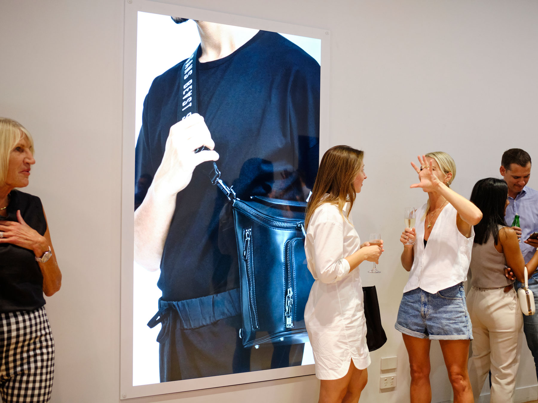
Showcased across large digital screens, the exhibition featured a project from each of the last ten years.
This was not intended to be our favourite work, rather these are projects that featured a learning, milestone or reference point which shaped the way we think about design.








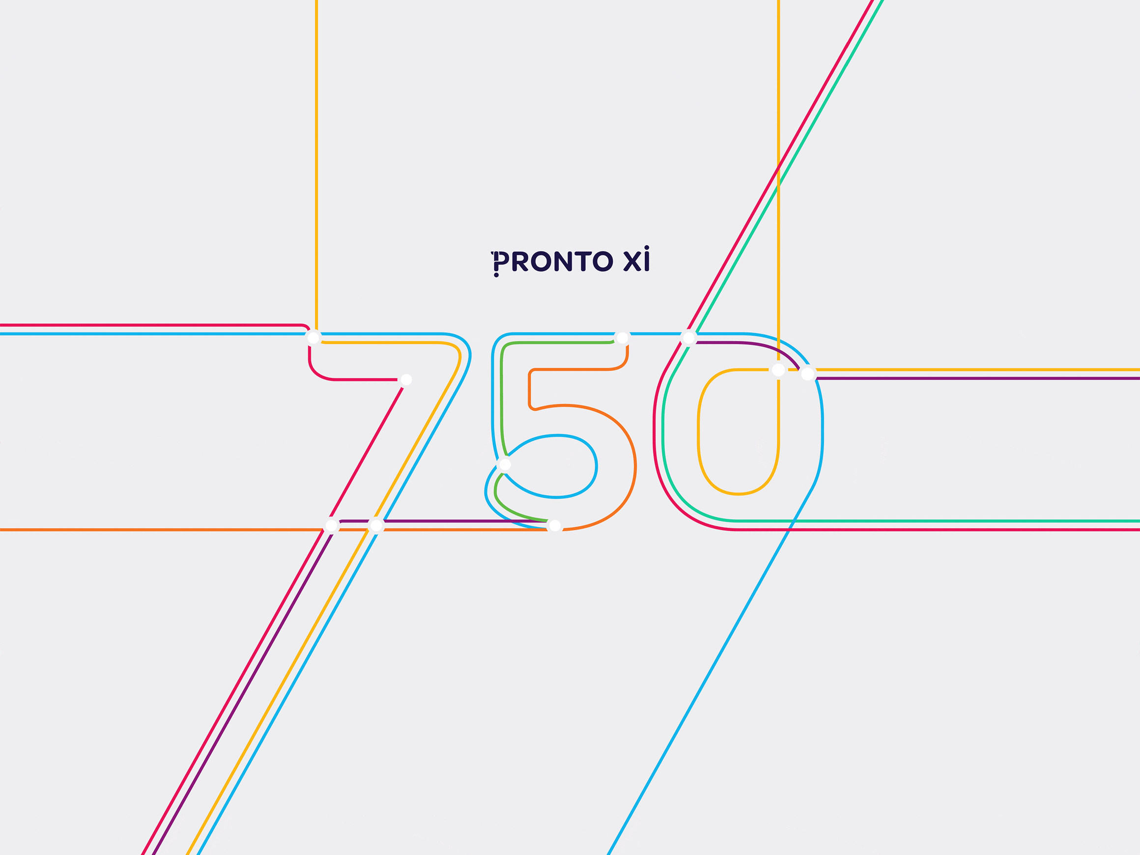
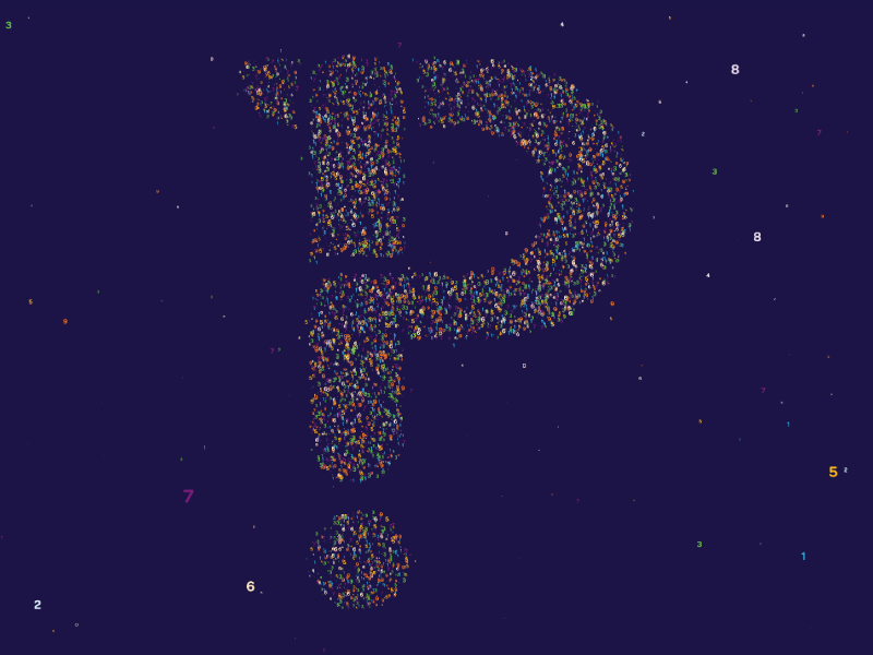
Pronto Software
2014–2019
Empathy is a great design tool.
Presenting the technological functionality a software client creates as benefits relevant to a business consumer.
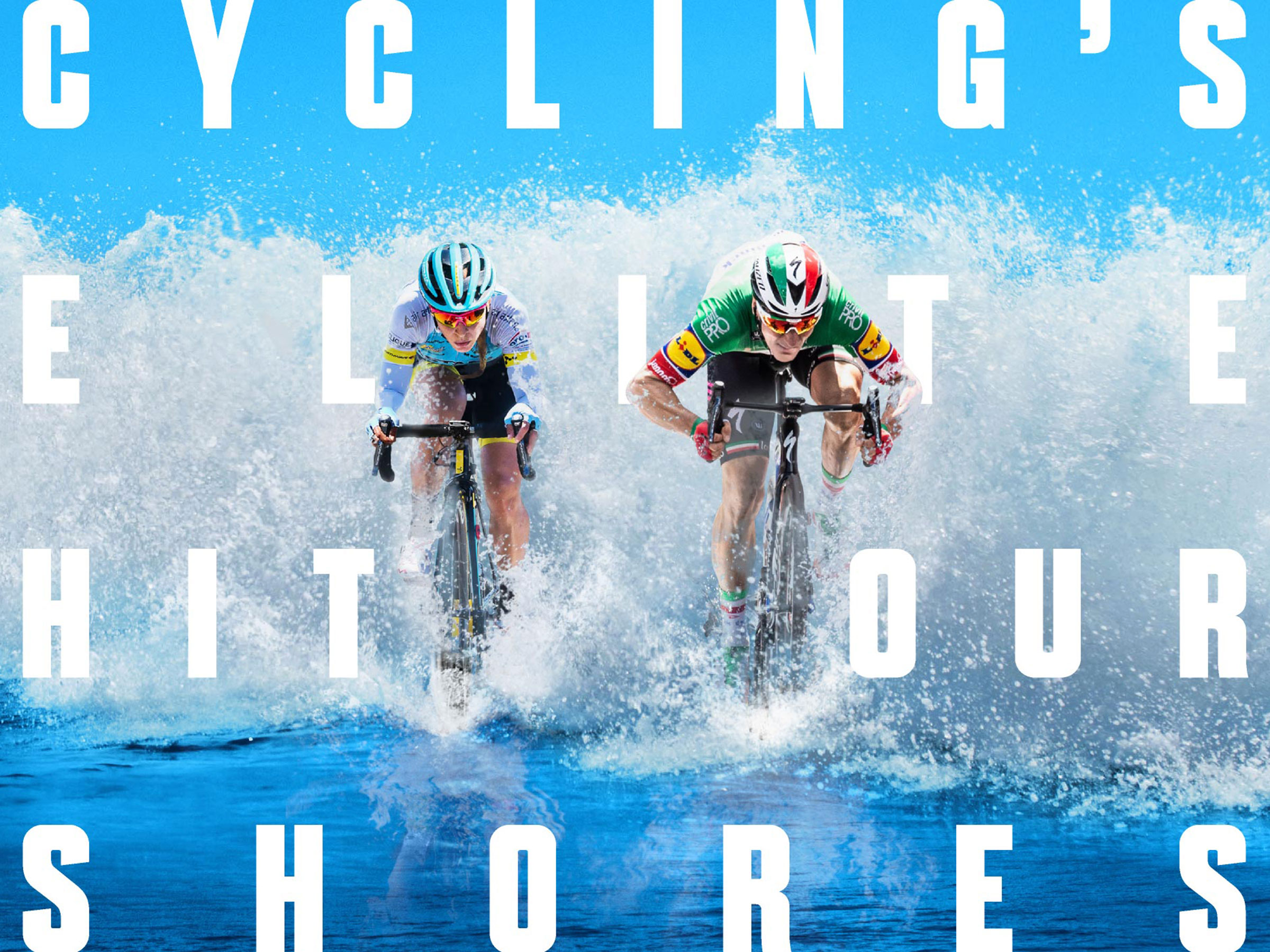
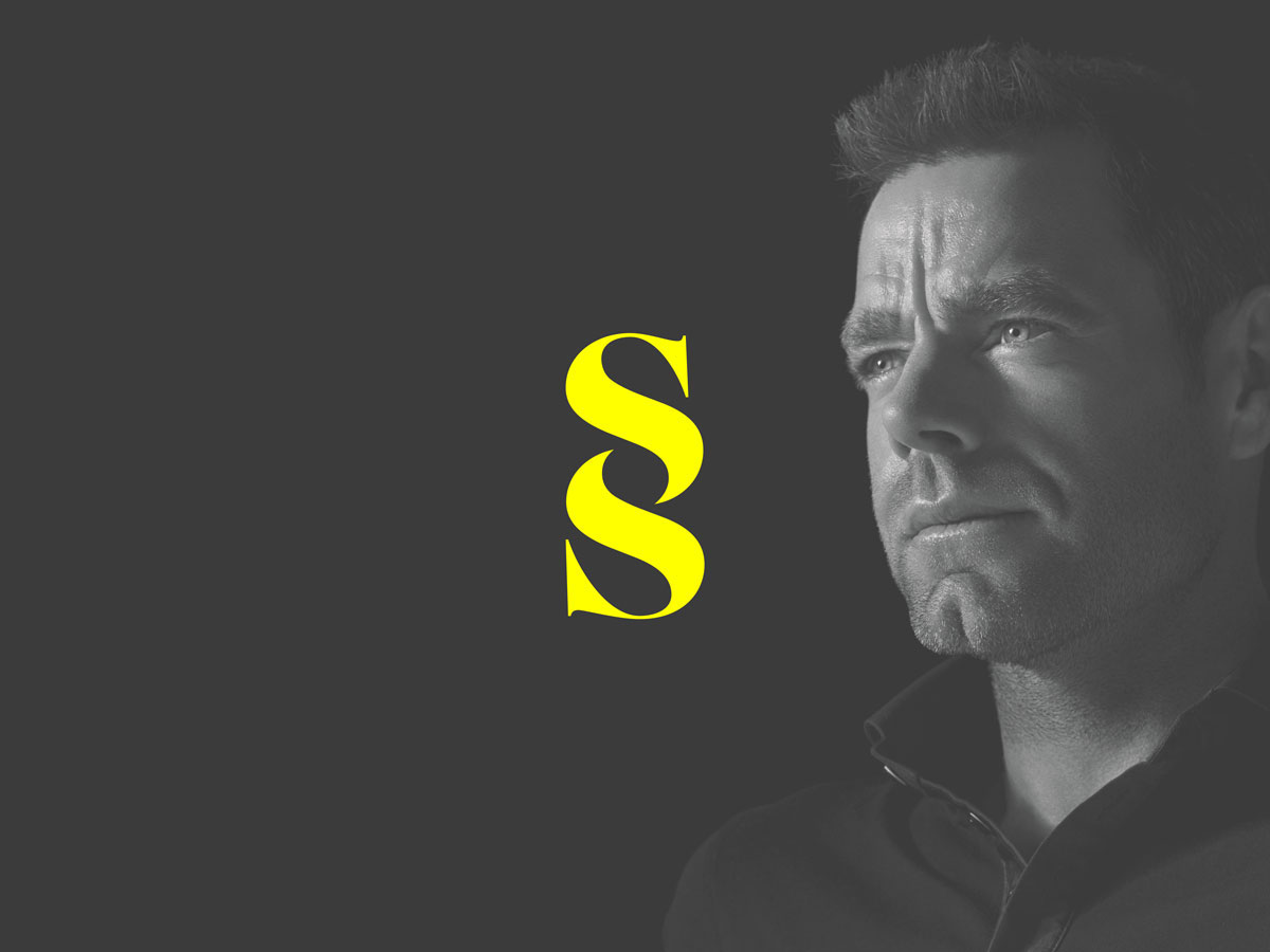
Cadel Evans Great Ocean Road Race
2015–now
An iconic design must be unique but easily understood.
Branding for a cycling event that is anchored to the Great Ocean Road’s serpentine forms and surf beaches.
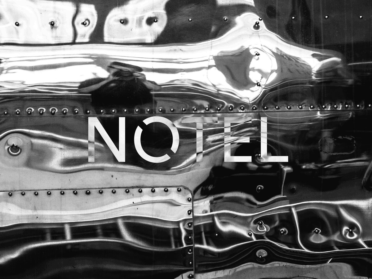
NOTEL
2016
The best ideas are infectious.
The pitch deck we created saw big names want to partner with a small start-up aiming to reflect the best of Melbourne.
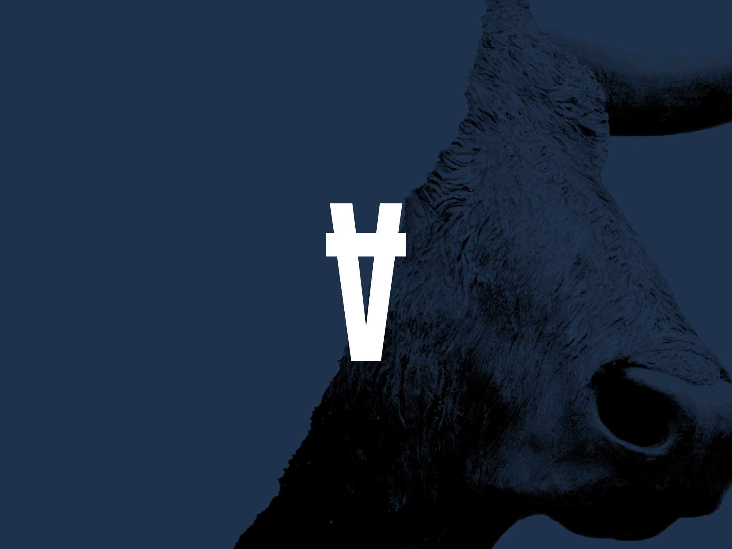
Sans Beast
2017
The power of working with a visionary founder.
Collaborating at the outset to build solid brand foundations, we love seeing how the marks we designed are applied to product in new ways each year.
Live Wire Park
2018-now
Don’t let the category restrain your thinking.
A genre-breaking identity for Australia’s first totally off-grid outdoor adventure park.
Baillieu
2019
Don’t let the current brand state influence where you can take it.
A company that was anchored to the past by a decade of experience, reframed as its greatest strength.
Chevron One
2020-now
Design with your audience front of mind.
Where a one-size-fits-all approach had failed, a tiered identity system, tailored by audience, helped this property development succeed.
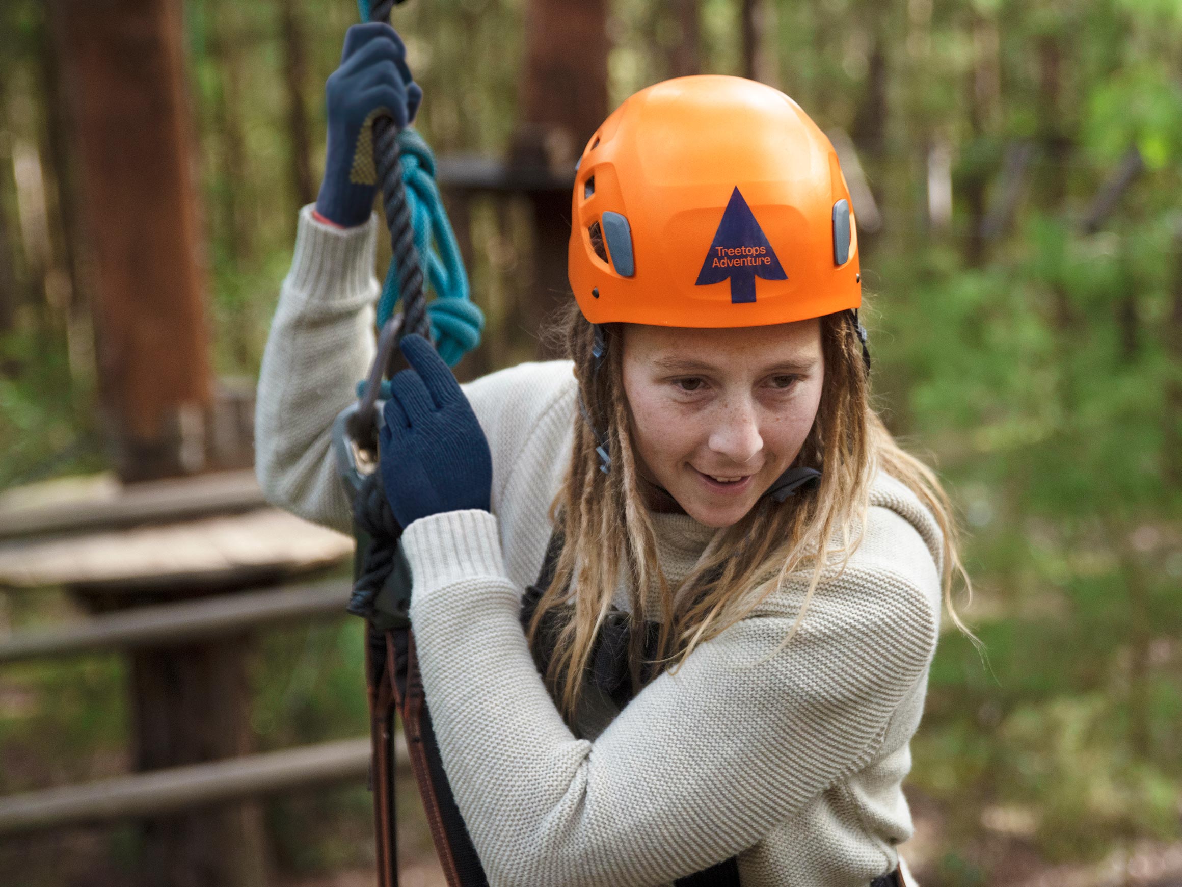
Treetops Adventure
2021
Project constraints can fuel creative solutions.
The system for classifying the difficulty of high-ropes courses became a visual identity signalling ‘a challenge for all ages and abilities’.
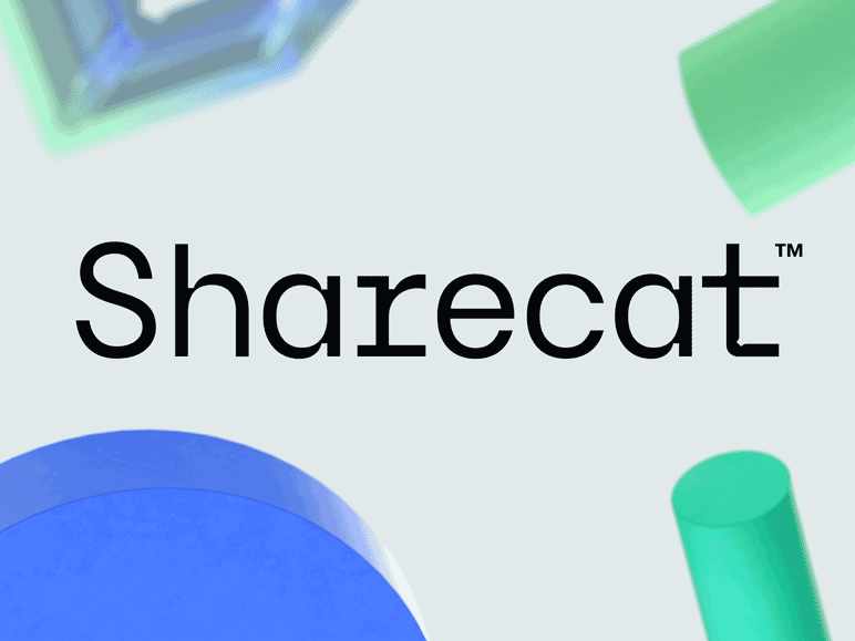
Sharecat
2022–now
Good ideas transcend borders.
Our first foray into Europe utilised 3D-rendered shapes as a visual metaphor for how Sharecat transforms data from ‘disorganised’ to ‘ordered’ and ultimately ‘optimised’ states.
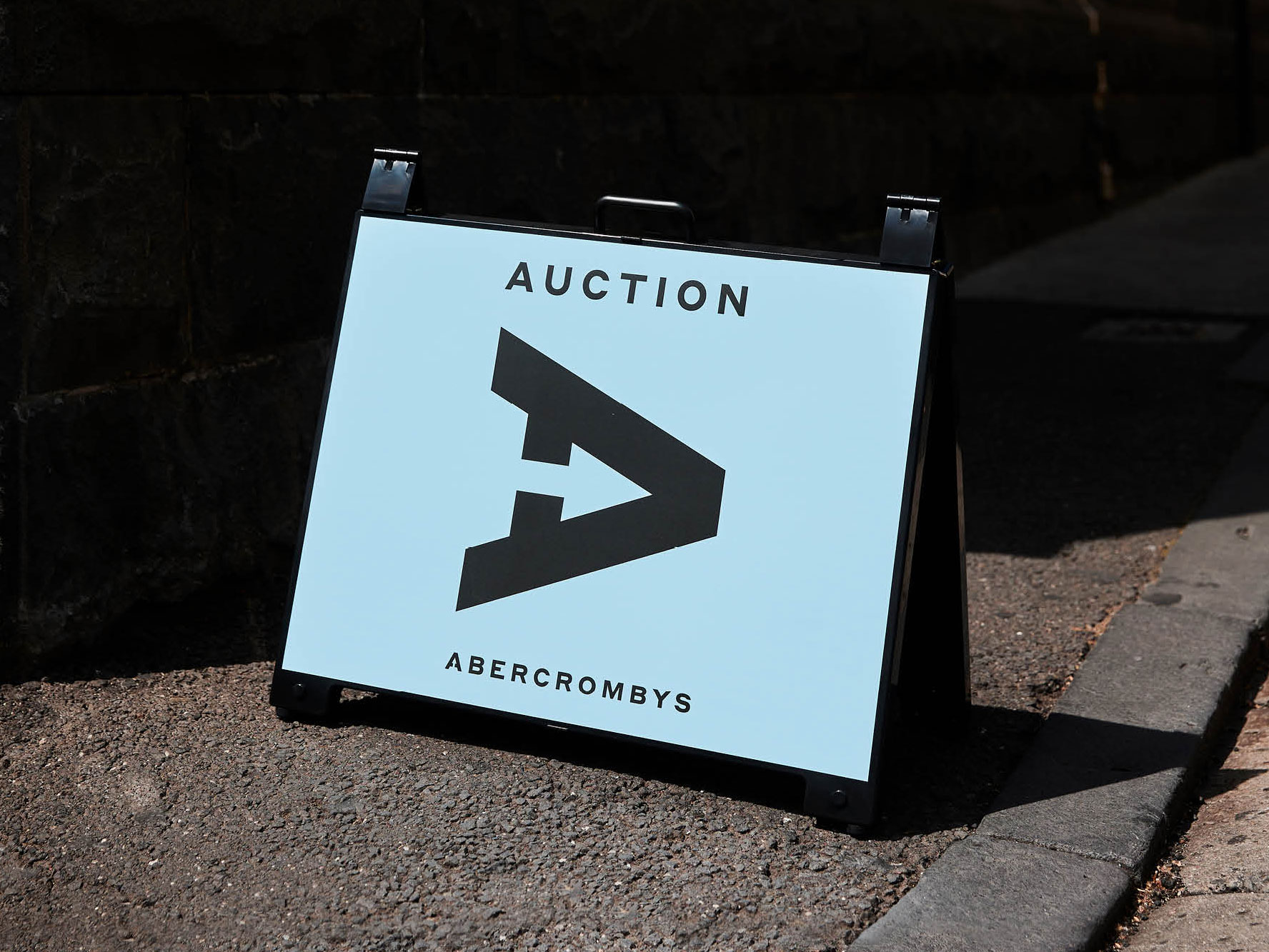
Abercrombys
2023
Work with what you have.
Already using graphic arrows and the tagline ‘Aim True’, a logo that featured an arrow pointing True North was a small step with a big impact.
